

Vero | Coffee & Gelato
Deliverables:
Branding
Collateral
Packaging
After many years of growth and evolution, Vero wanted to infuse some new energy into their brand of authentically handcrafted Italian coffee and gelato.
You can find their products HERE!
Logo: Marc Girouard & Tory Cunningham
Art Director: Renee Dimalla
Creative Director: Andrew Bolton
We were really excited when we got to taste Vero’s products because the quality showed through immediately. Getting to know the Lollino family, we knew celebrating their story through the look and feel was integral to getting the design right.
Italian Tradition with the American Spirit
Starting out, we knew the Vero family wanted to refresh their logo that was known throughout the city of Chicago. Keeping the brand recognization they had spent years building was a huge portion of updating their brand identity.

We upgraded the main slab serif used in the primary typeface to a serif that we heavily customized. Doing this allowed us to showcase the high quality of their offerings which include coffee, gelato, and pizza.
The badge shape and color was instantly recognizable within their local community, so we knew keeping that was imperative. We updated its shape to be more sturdy, emblematic, and included the 6 pointed star that represents Chicago.


Navy blue and a bright red as two of the main brand colors exemplified classic and elegance. They needed to allow for a cohesive look and feel, as Vero’s offerings are wide.

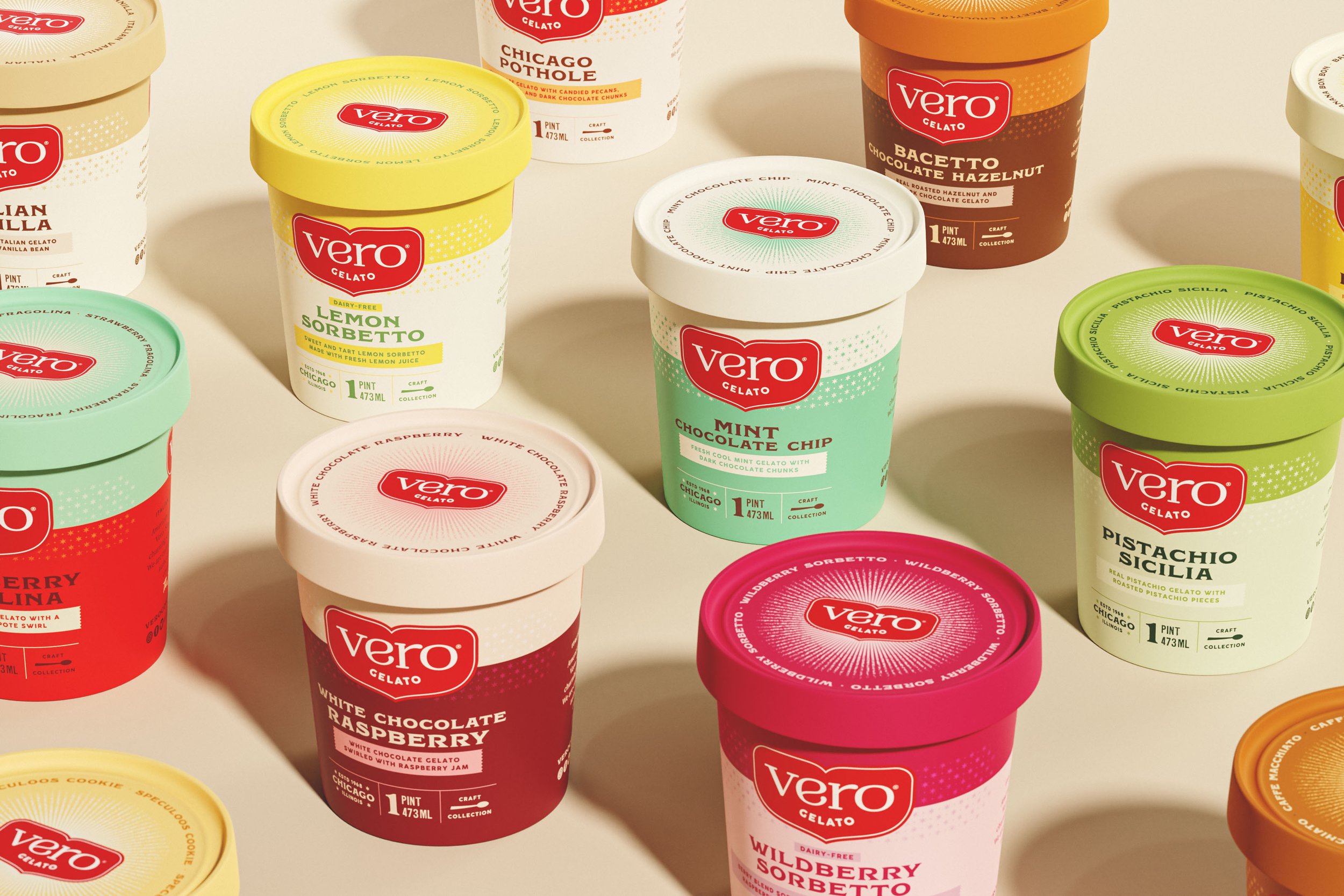
While the main brand palette spoke to tradition and high quality products, gelato could lean into being a little more fun and charming. We picked a unique color palette for each gelato flavor that spoke to its flavor profile.


Vero’s original gelato designs were a bit sporadic, but did have elements of cohesion that we were able to pull from. This included having the logo front and central.
The unique color palettes chosen also allowed for an easy way to have hierarchal organization. We made use of the Chicago 6 pointed star as a decorative element, giving the gelato pints texture while maintaining its high quality.


Vero’s coffee leaned into the parent colors of navy and red, retaining a sleek blast of the two: One for whole bean coffee, and another for ground coffee.


We wanted to streamline what Vero’s bags were originally, into something that didn’t lean into Italian cliché. Rather, minimalism and typography took the reins to produce something more scaled back and elegant.
Like many coffee companies, we wanted the flavor offerings to be easy at a quick glance for consumers, assigning each their own color. We also utilized the 6 pointed star with some other areas of spot gloss for a tactile addition.
