Scratch & Peck Feeds
Deliverables:
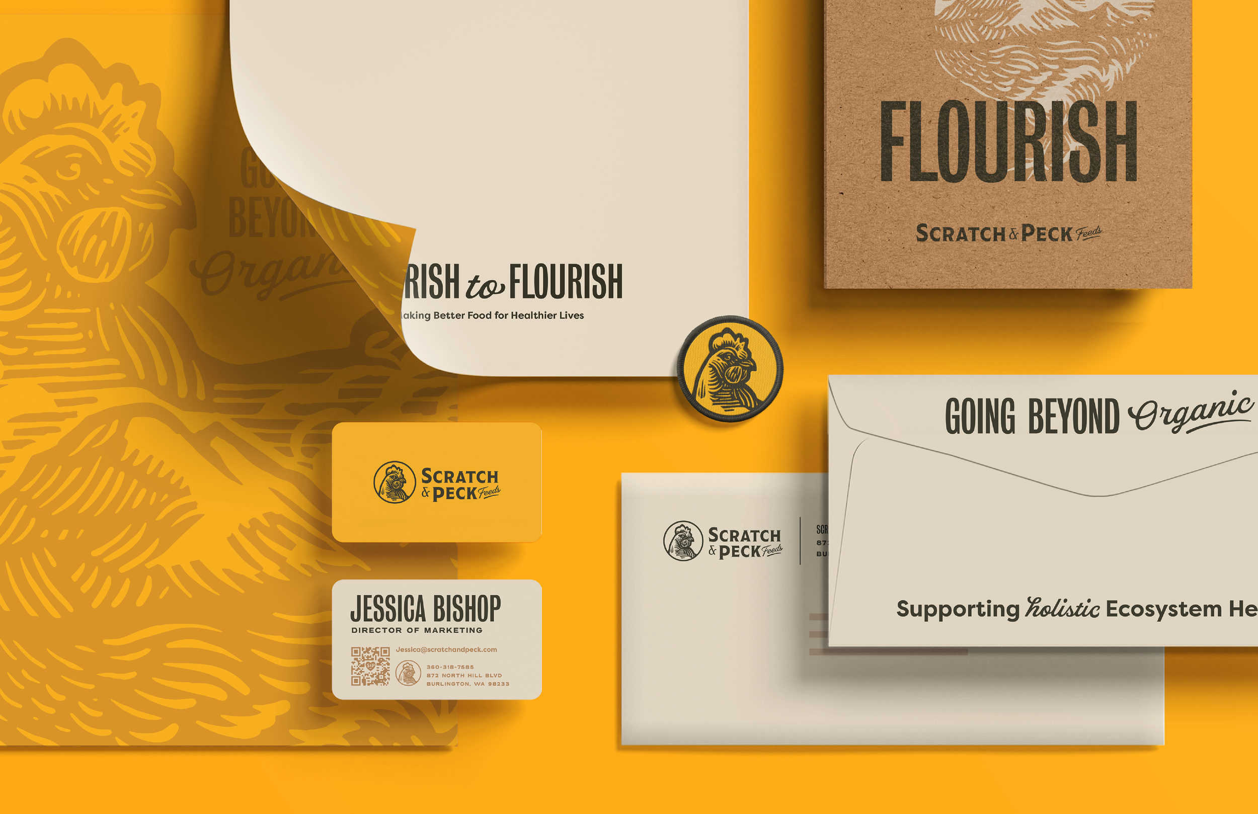
Branding
Collateral
Packaging
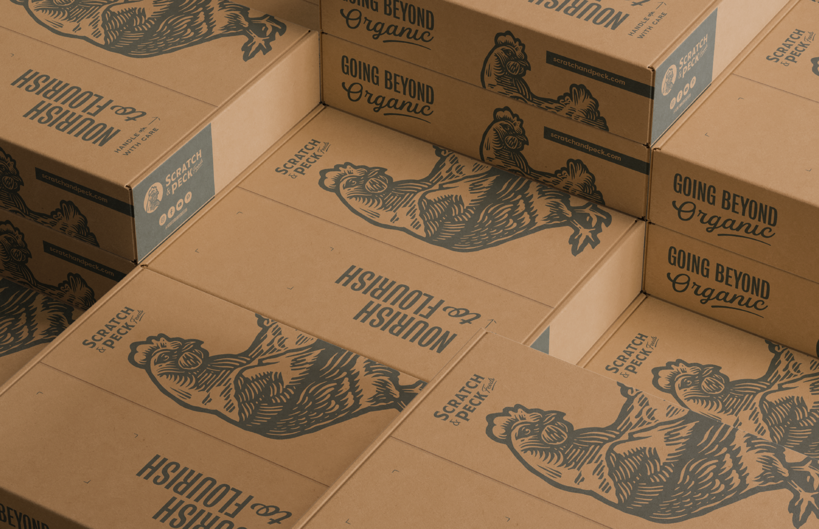
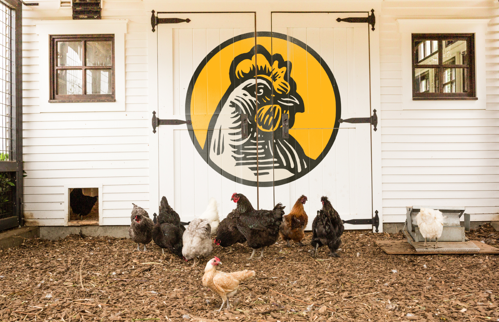
Scratch & Peck Feeds is an established producer of organic animal feed who had a prominent consumer base, but needed to liven up their brand to match their growth in the feed industry.
You can find their products HERE!
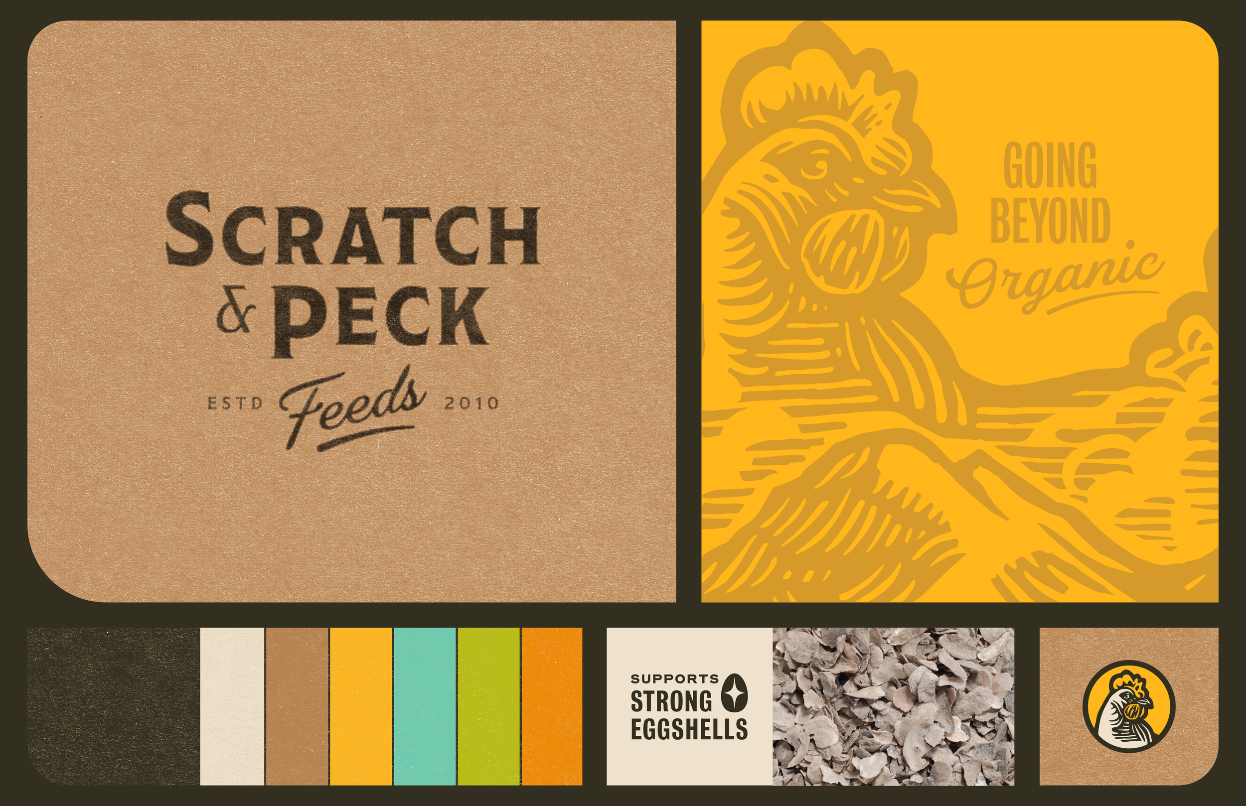
Logo: Marc Girouard
Illustrations: Dani Severson, Marc Girouard, Tory Cunningham
Art Director: Renee Dimalla
Creative Director: Andrew Bolton
Website: Murmur Creative
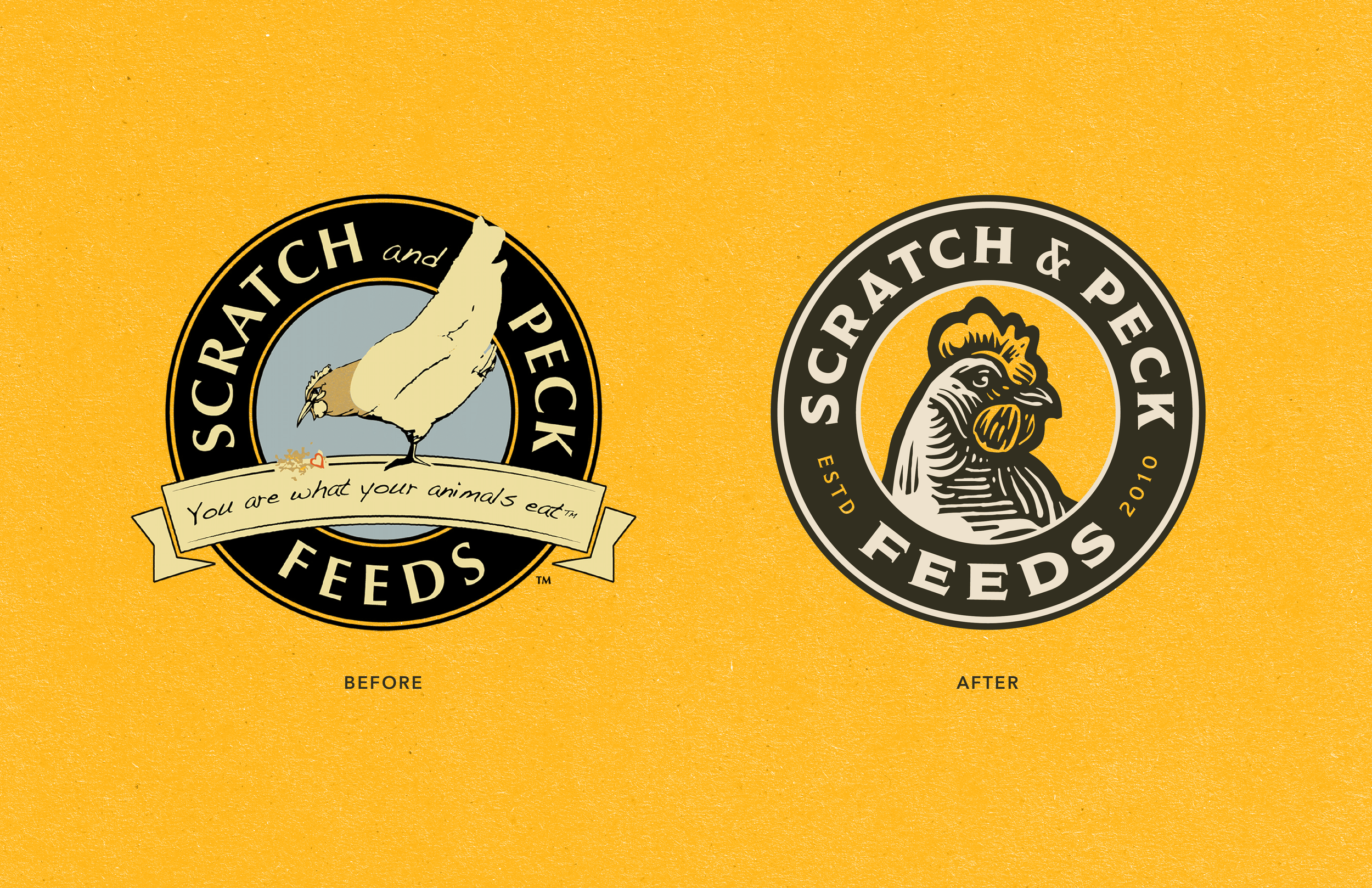

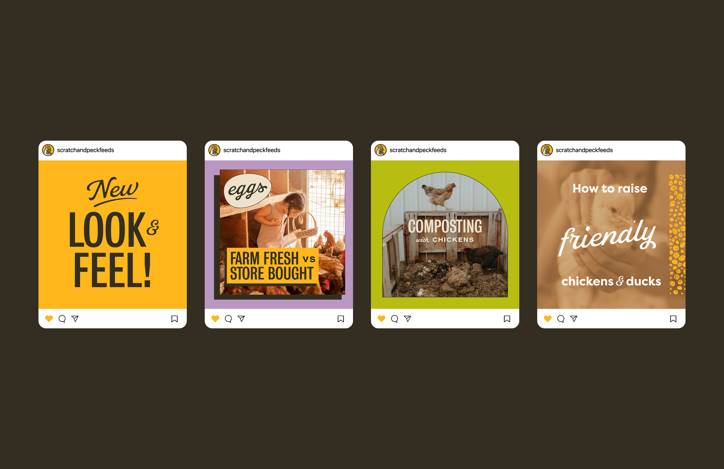
The S&PF team had a vision that really pushed what was a great DIY and down to Earth aesthetic they had been working with.
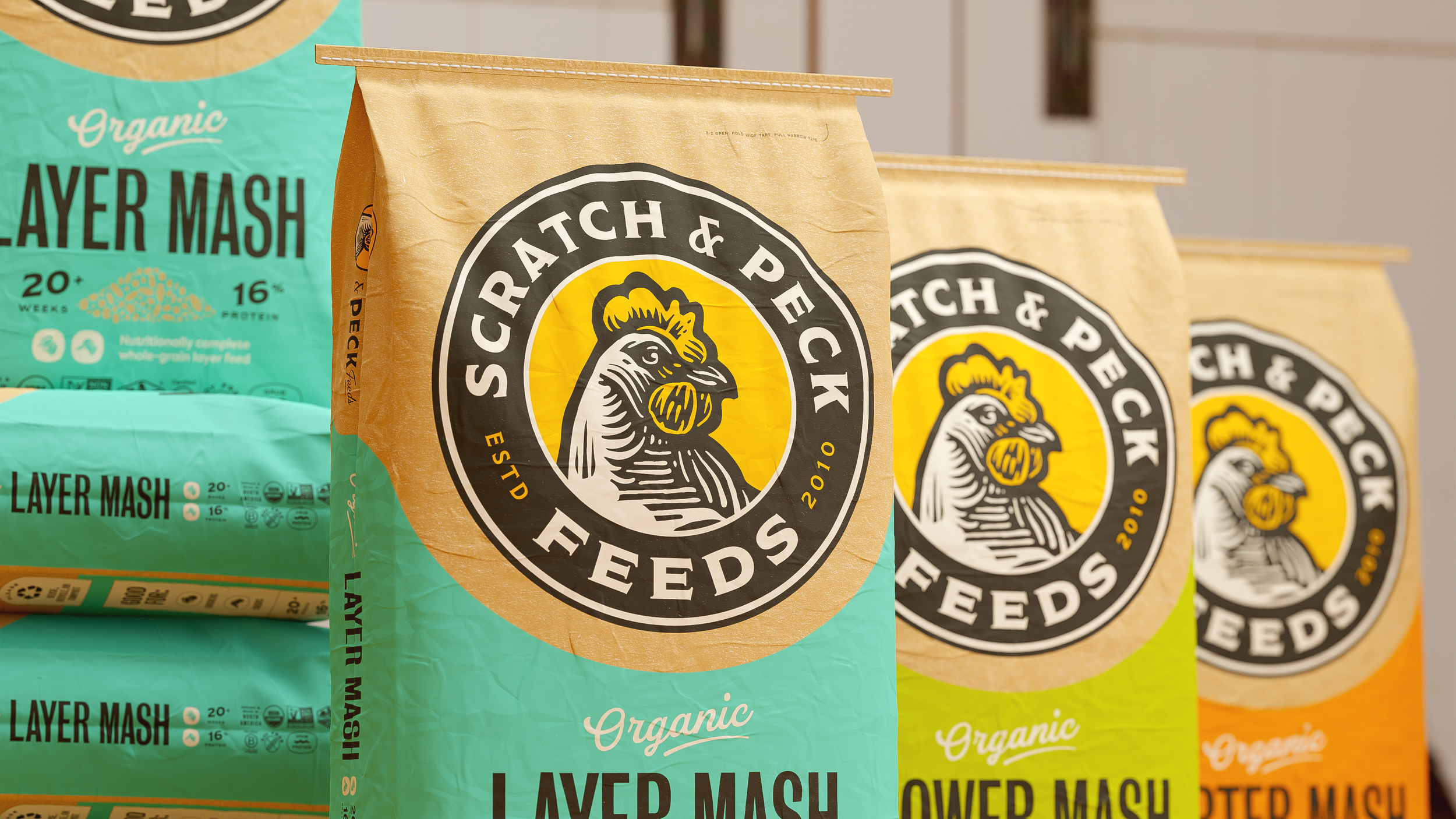
We were able to figure out a look that leaned into established, thanks to the logo done by Marc Girouard.
Nourish to Flourish
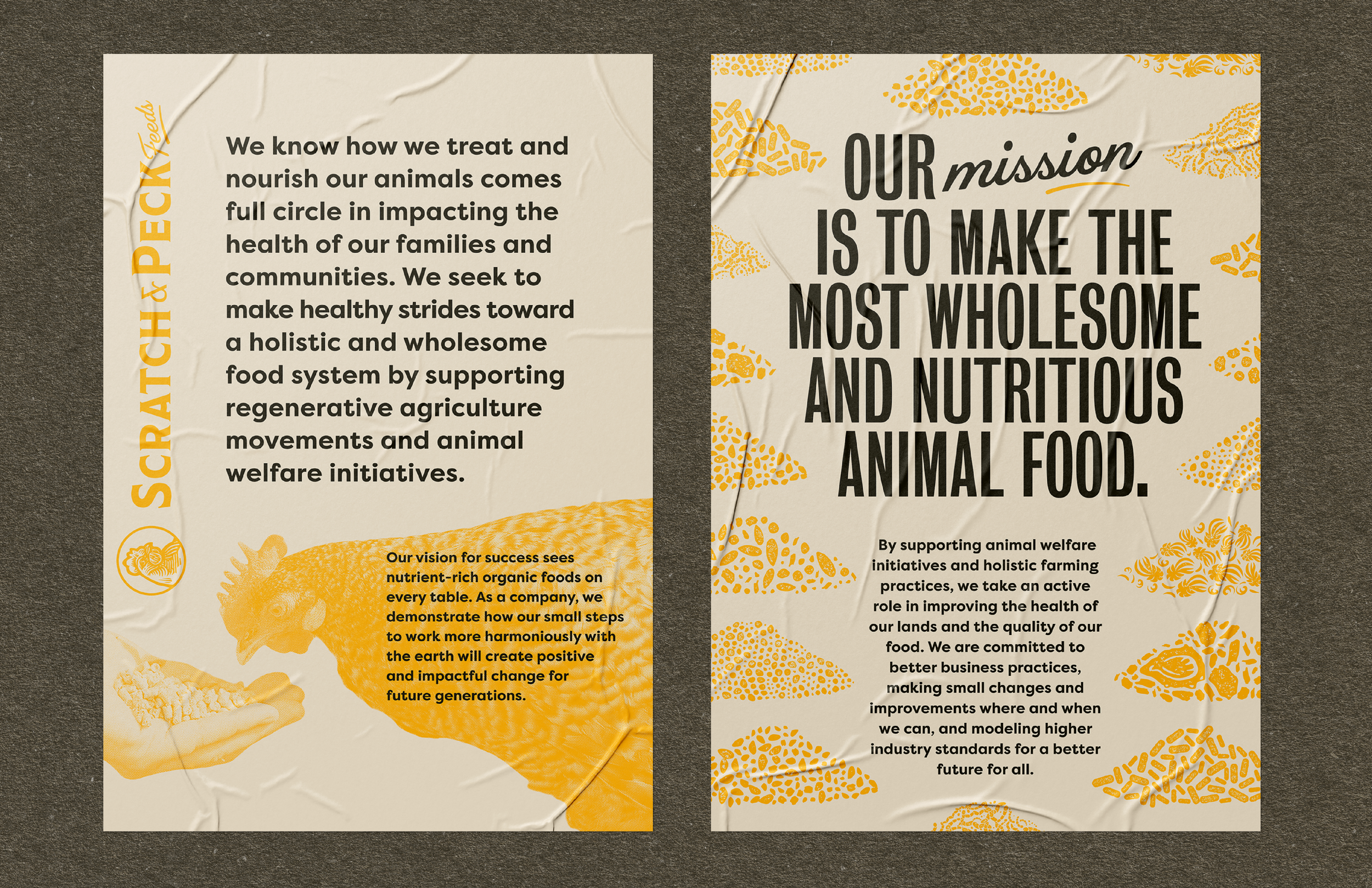
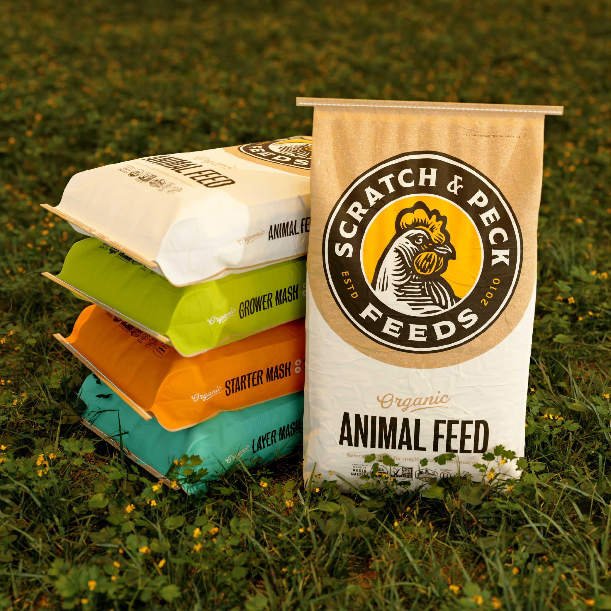
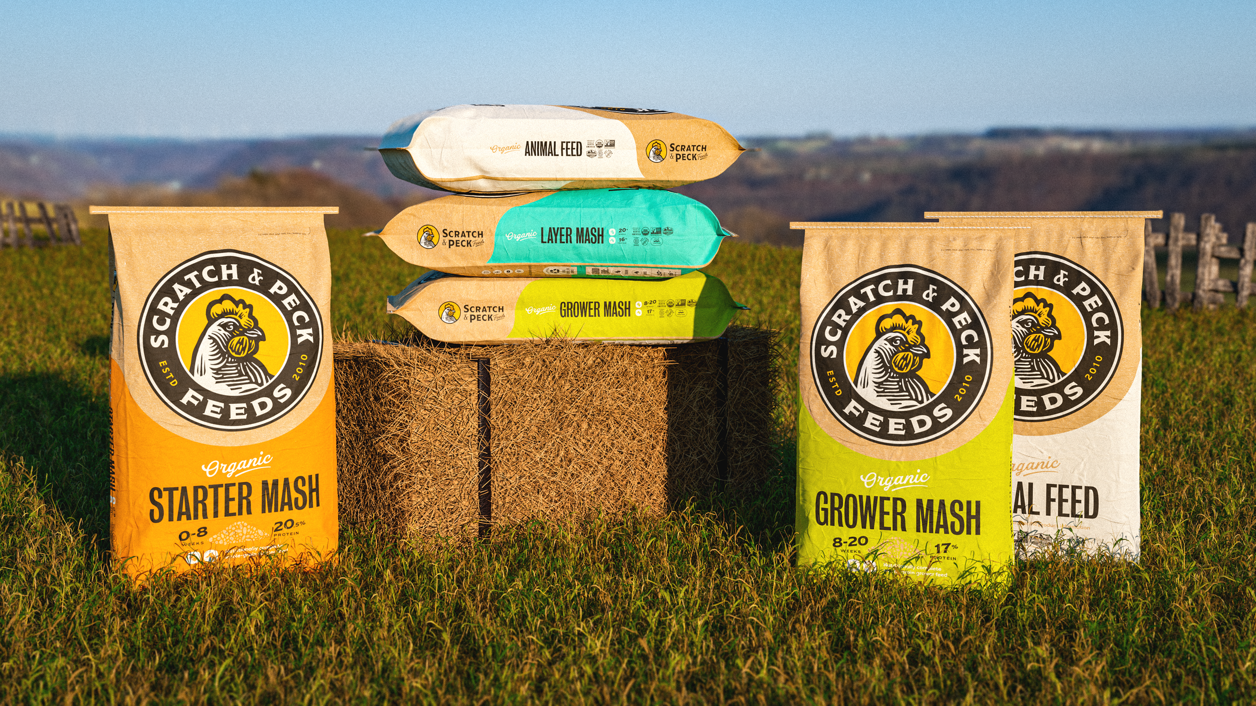
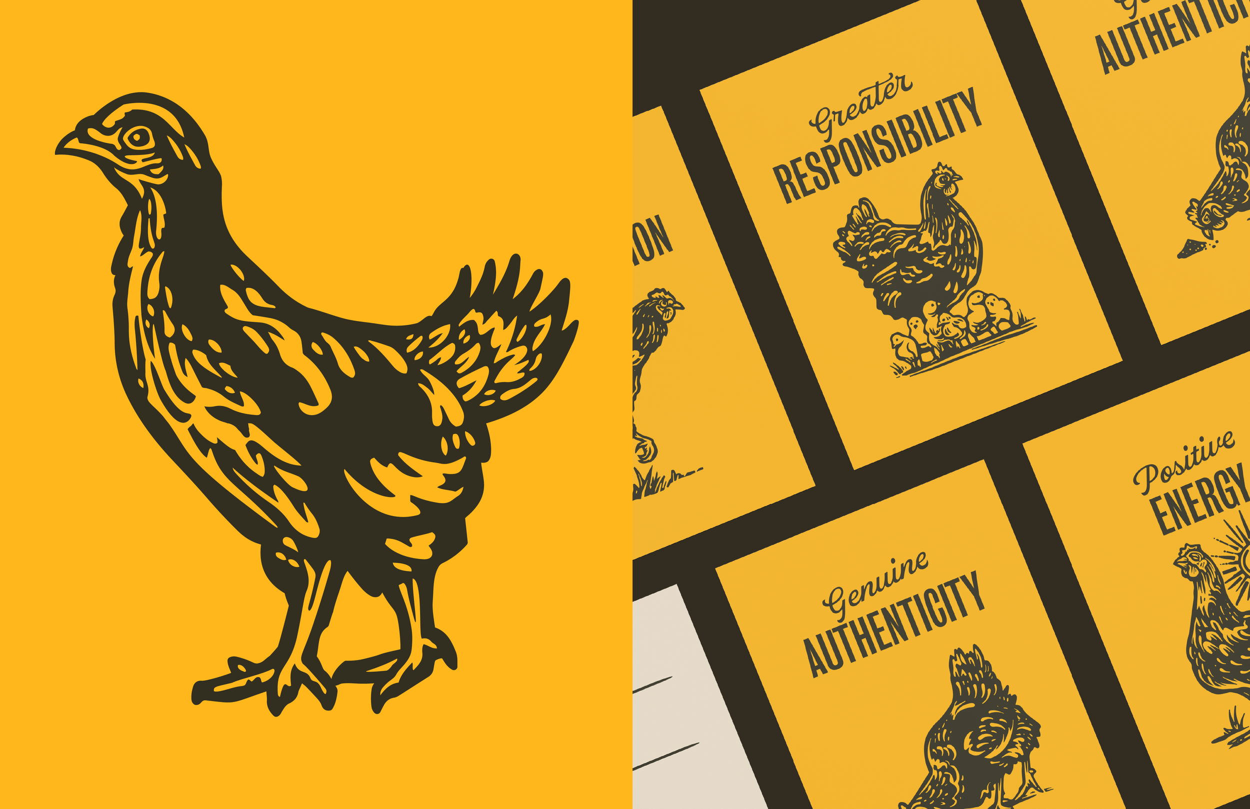
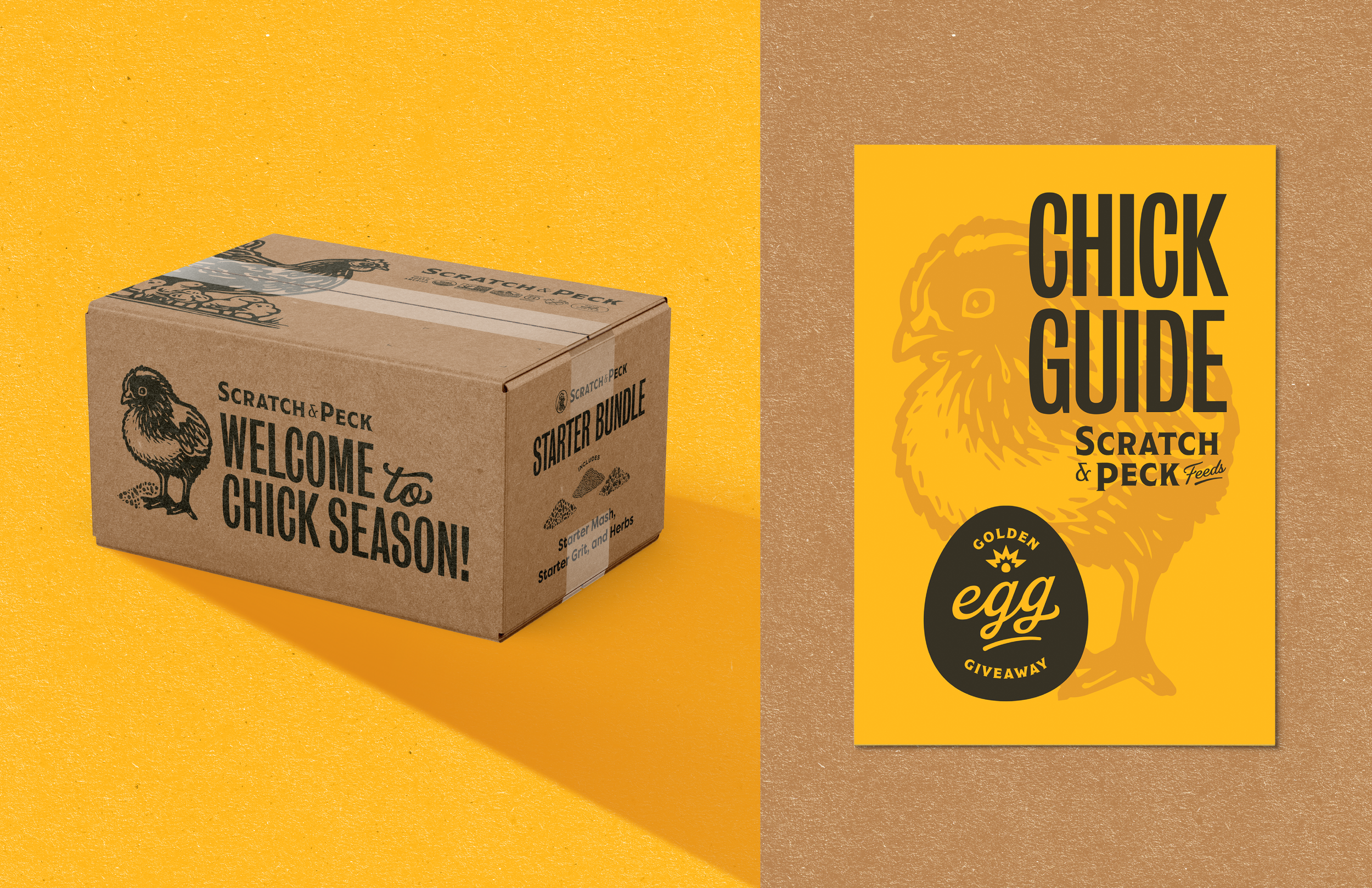
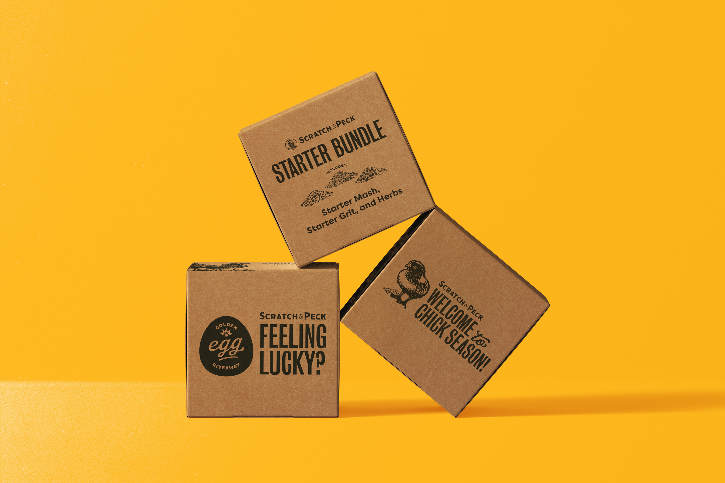
Marc’s logo really helped bring the branding together in a way that allowed us to establish visuals that emphasized Brand Strategy’s Brand Pillars. All were lighthearted, yet spoke to this awesome brand that S&PF’s founder Diana Ambauen-Meade had initially created to get her own chicken flock nutritious feed.
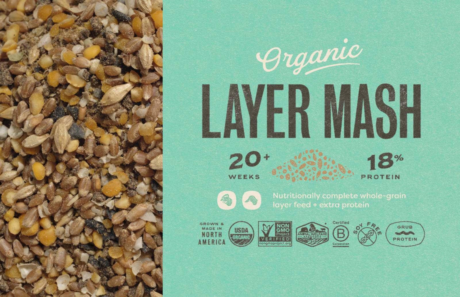
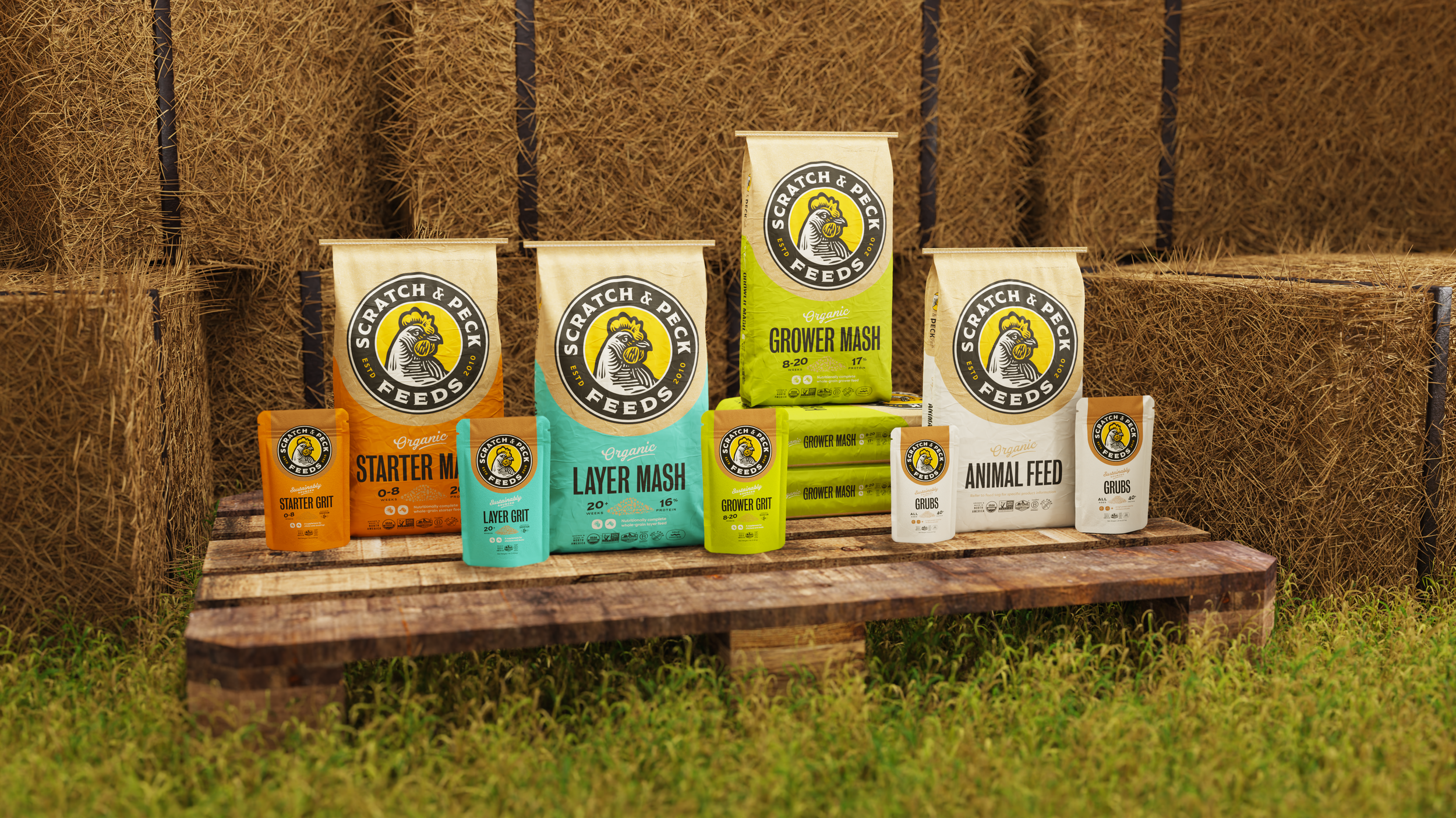

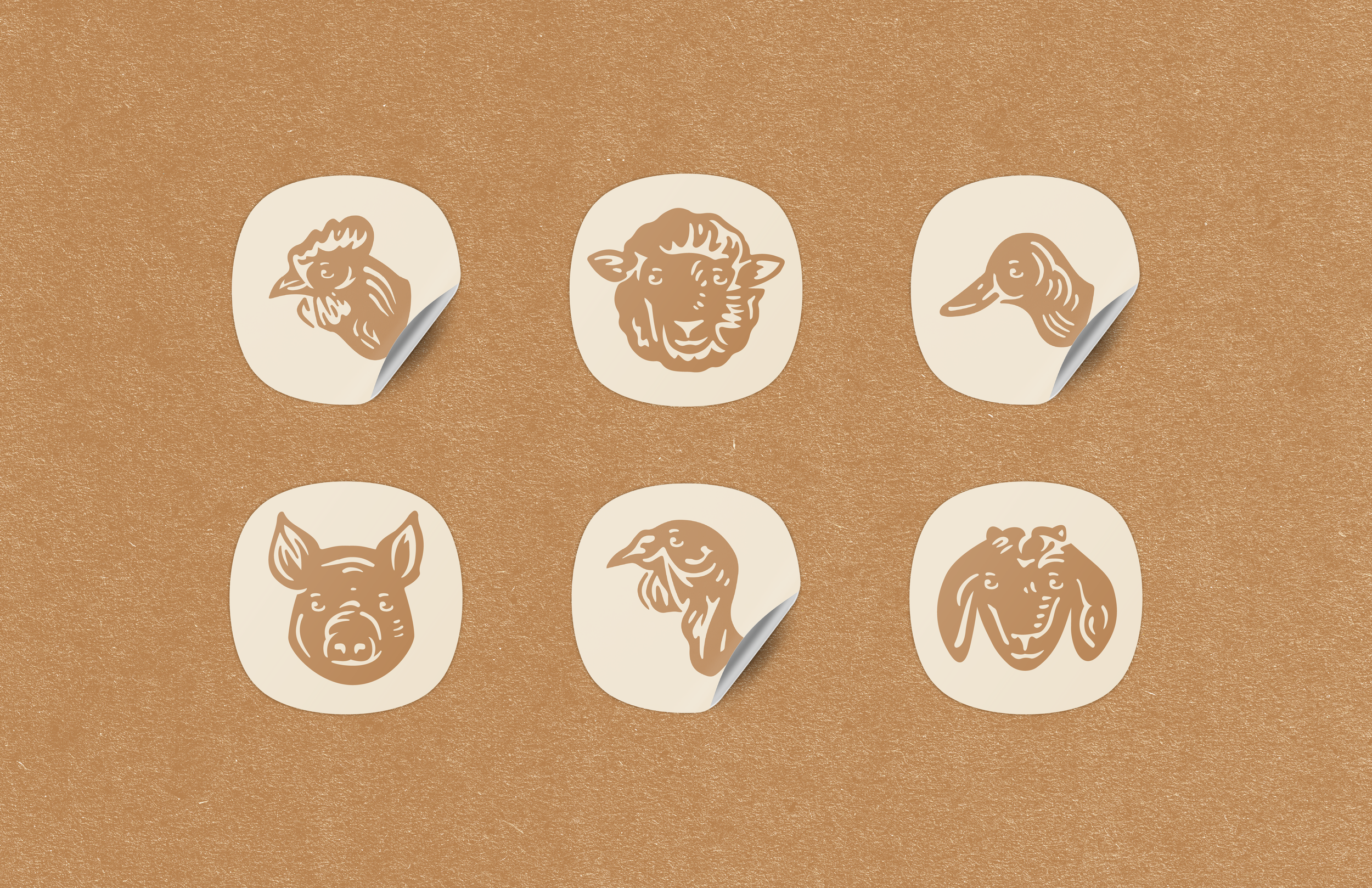
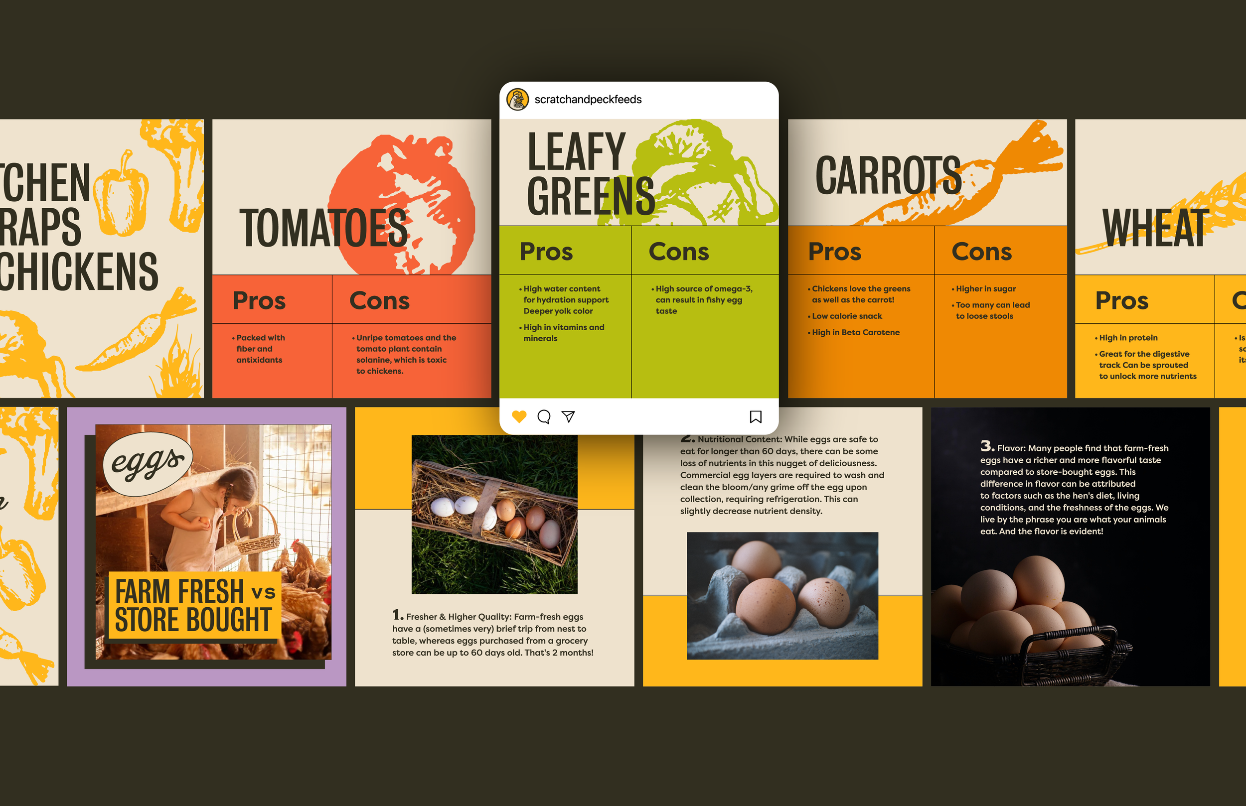
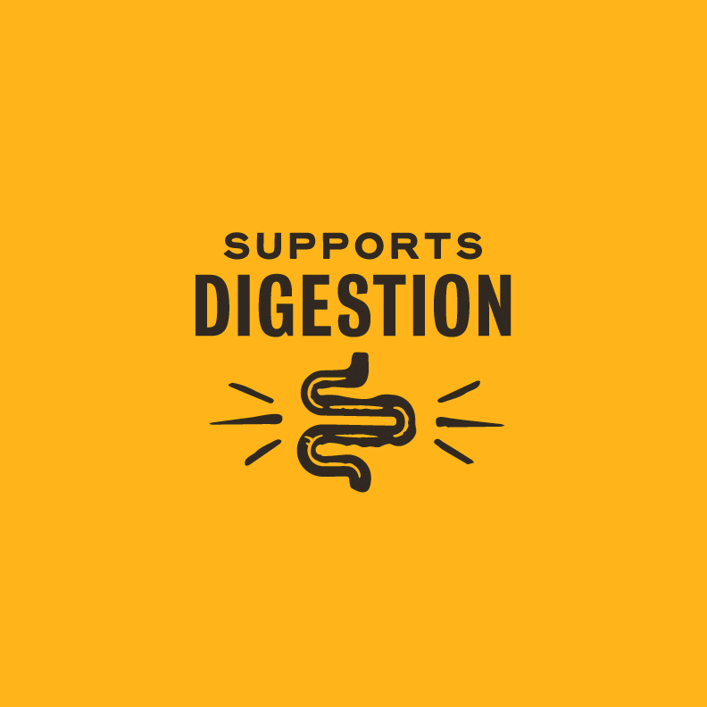
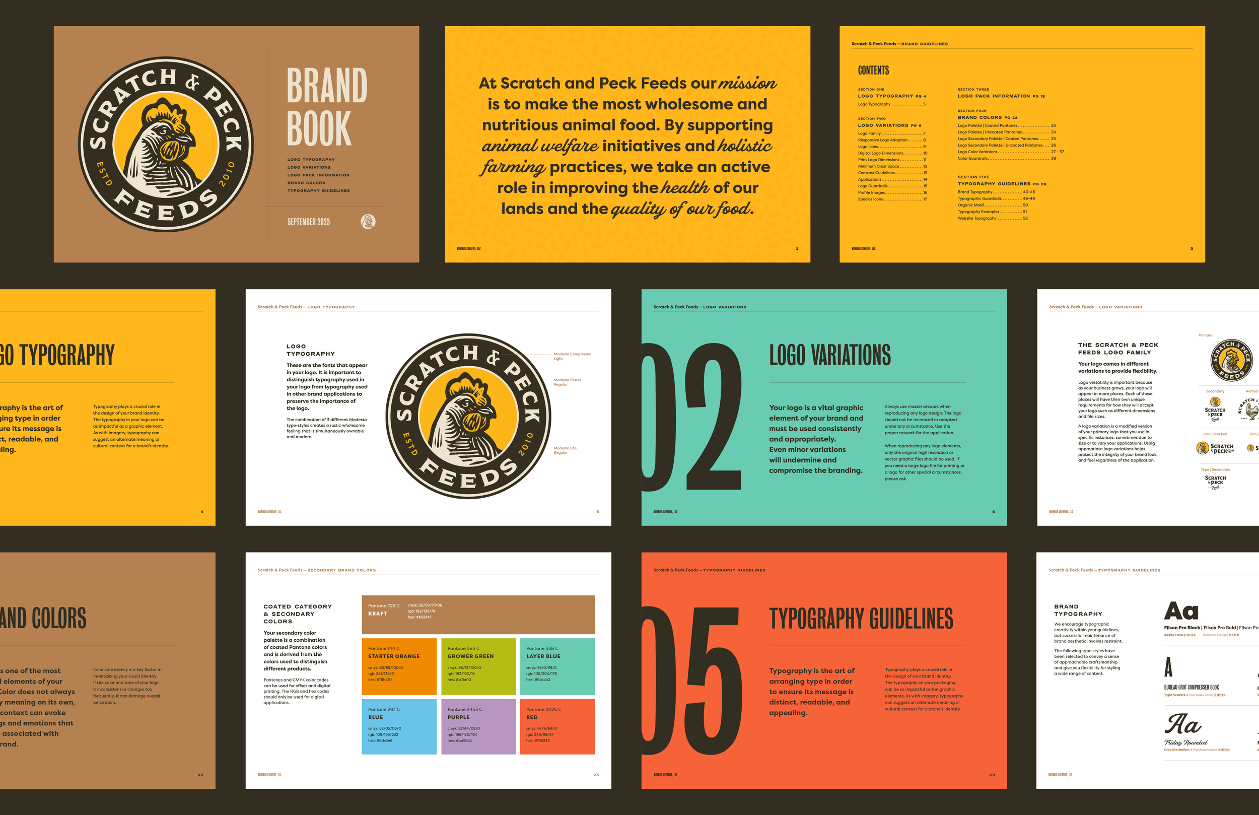
Icons were created that better helped consumers figure out which animals could eat the feed, while 3 colors were used to divide the food into feeding stages. Orange was used for Starter feed, which includes chicks and young chickens, while green and a bright aqua blue were used as Grower and Layer feed.