Portland Cider Co.
Deliverables:
Branding
Packaging
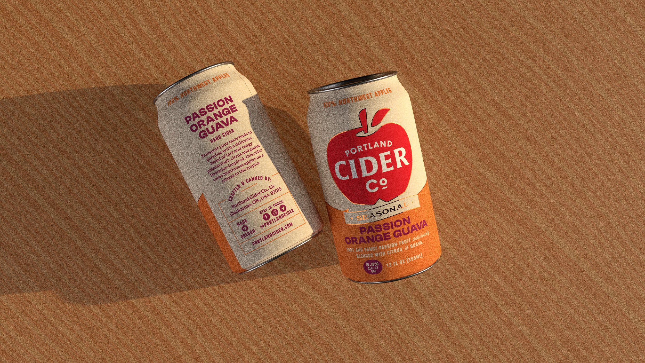
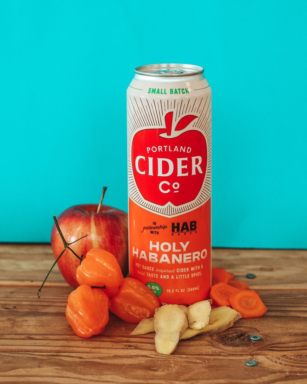
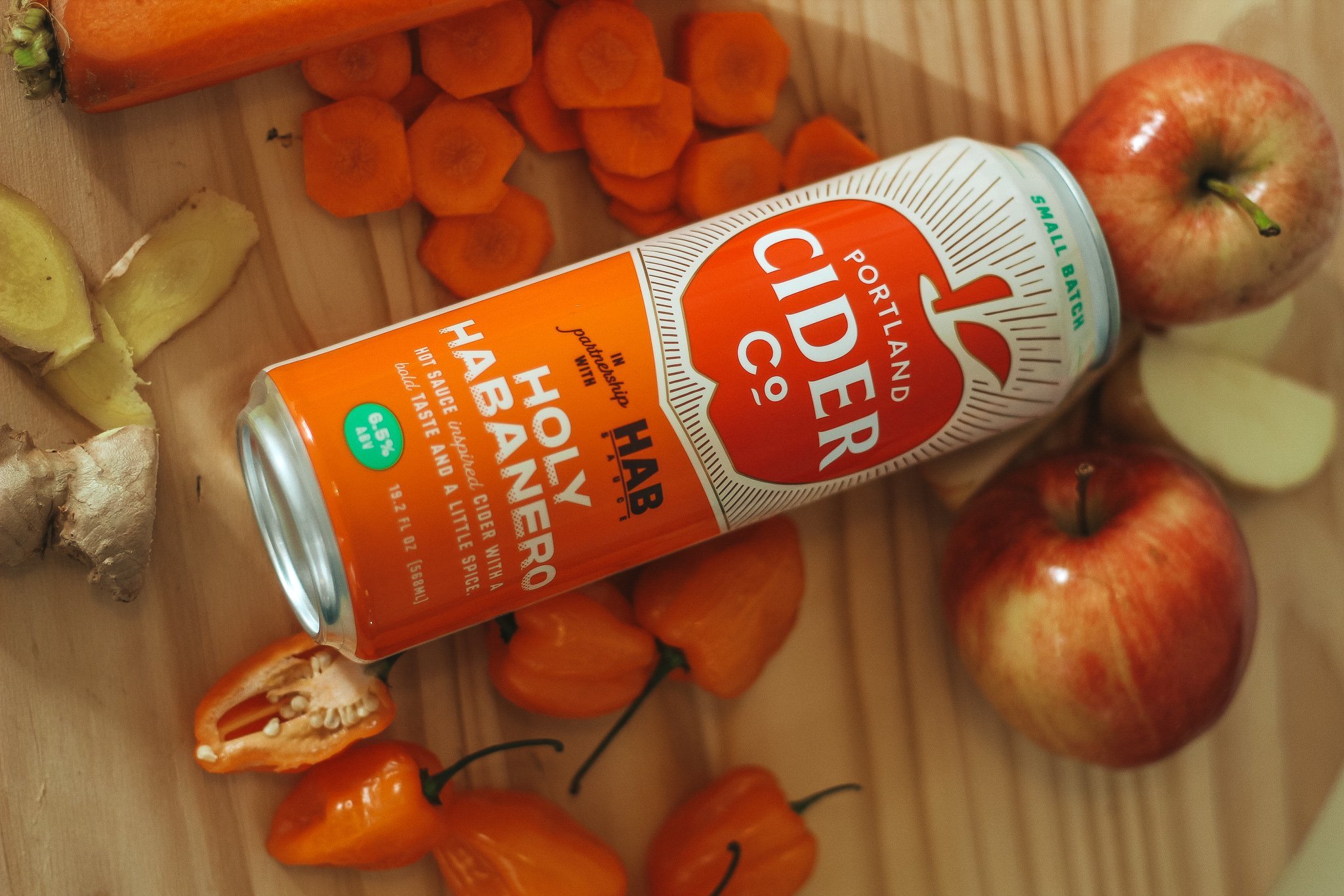
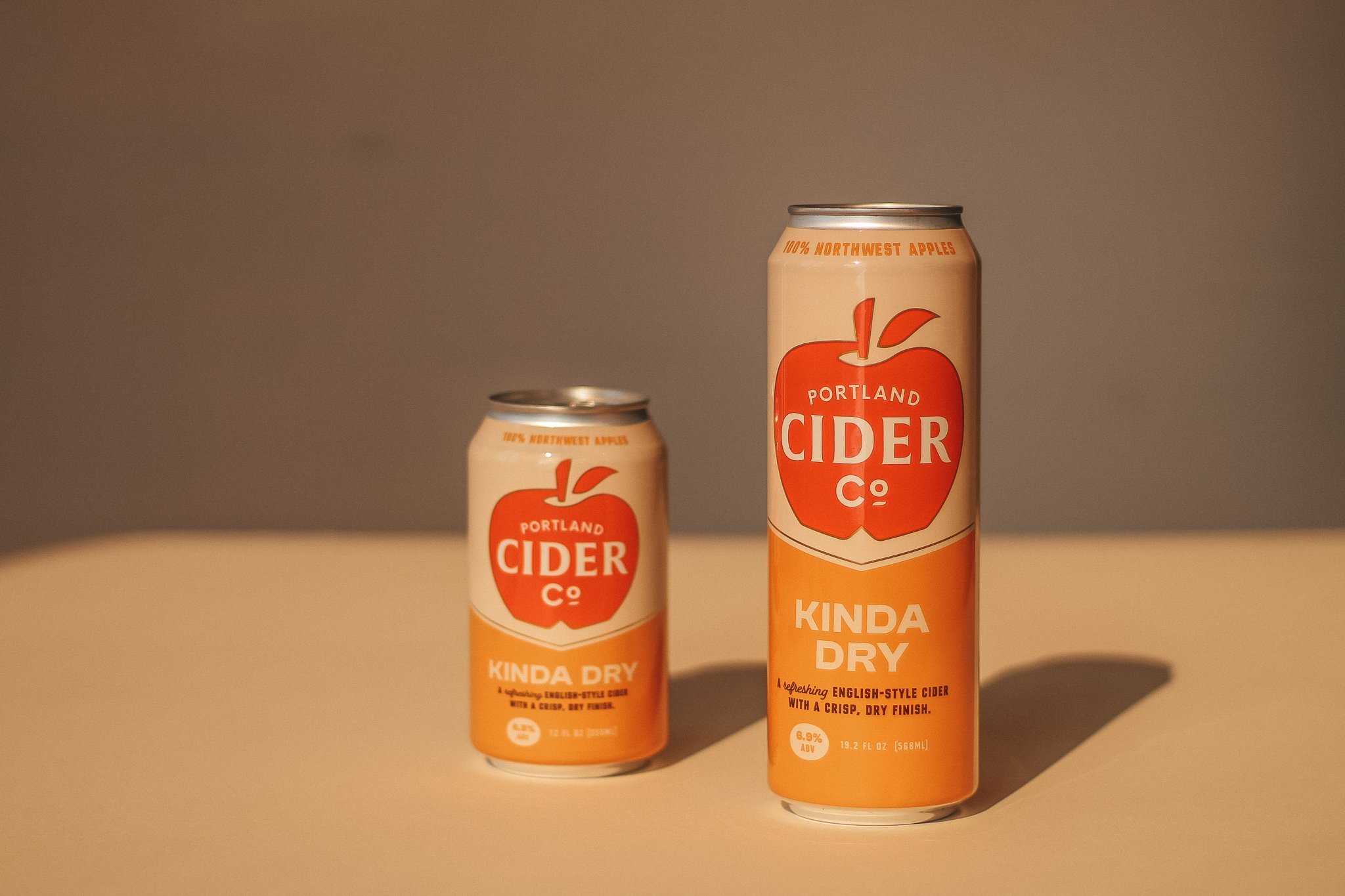
Steamrolling to the top of the Northwest cider game, Portland Cider Company needed a new polished look and feel to reflect their award-winning status. We developed a clean packaging system to work for their year-round, seasonal and small batch ciders and a spiffy new logo to take center stage across their brand.
Photography: Portland Cider Co.
3-D Image Renders: Tory Cunningham
Art Director: Renee Dimalla
Creative Director: Andrew Bolton
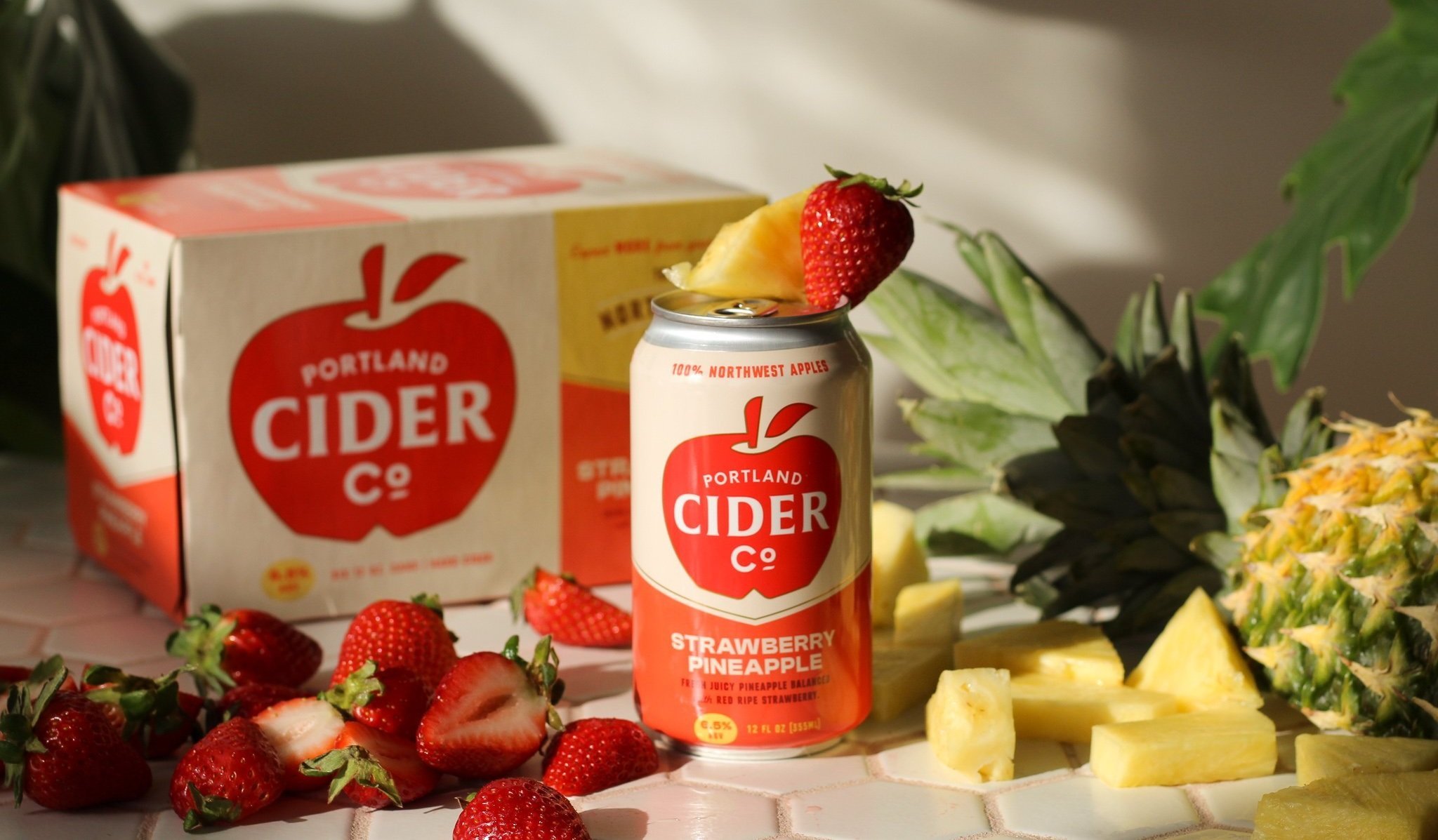
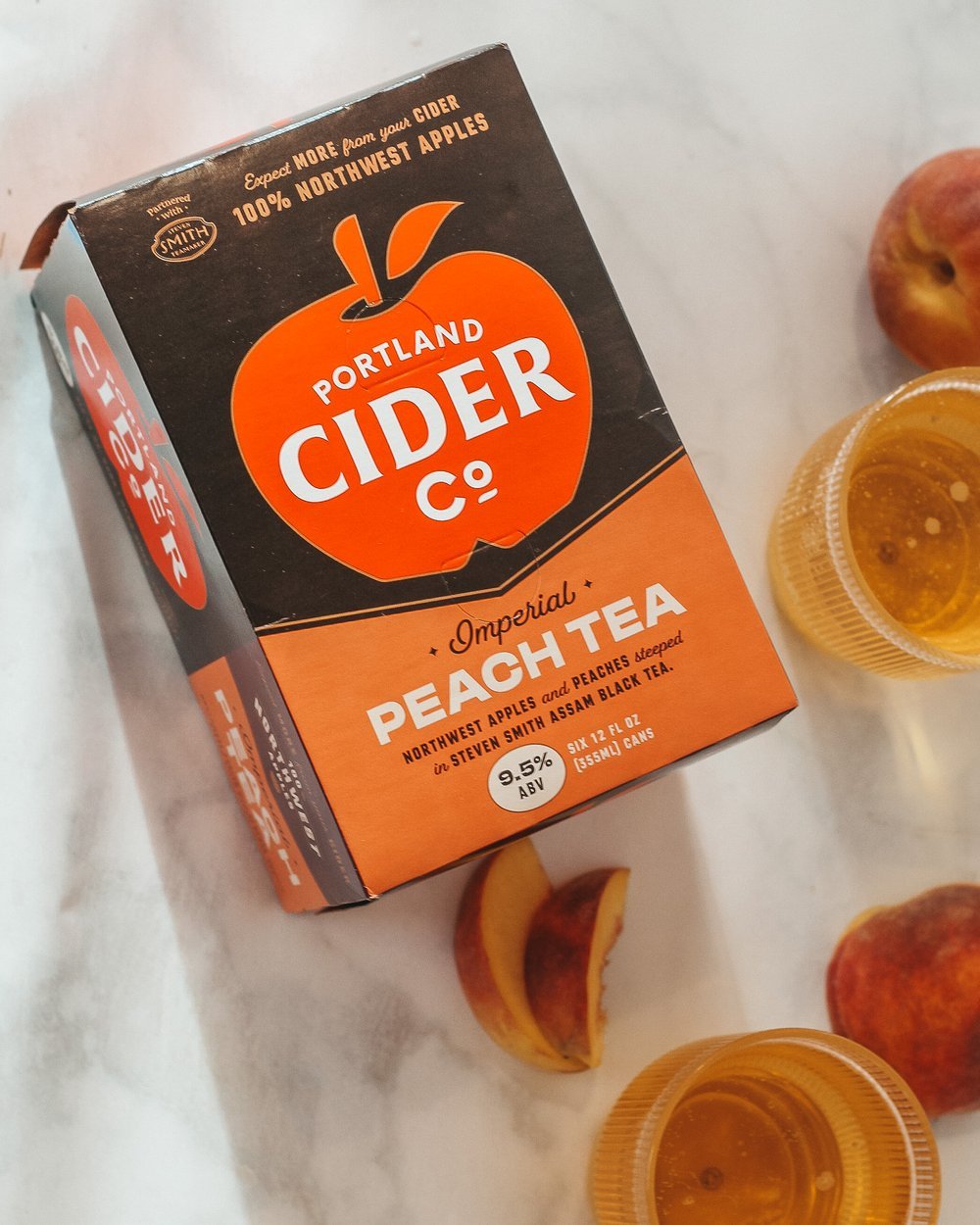
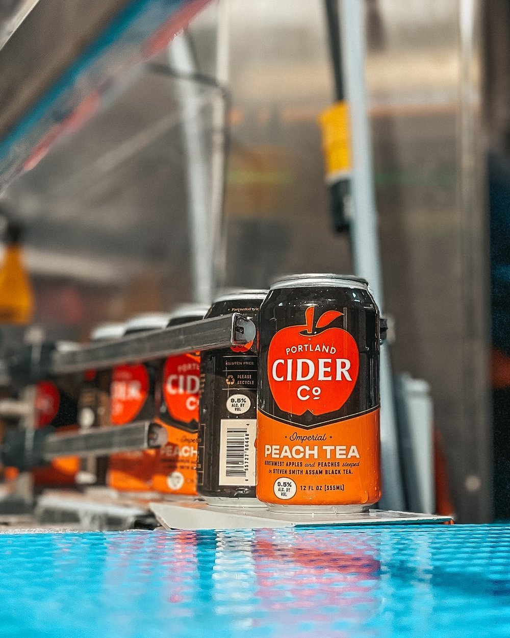
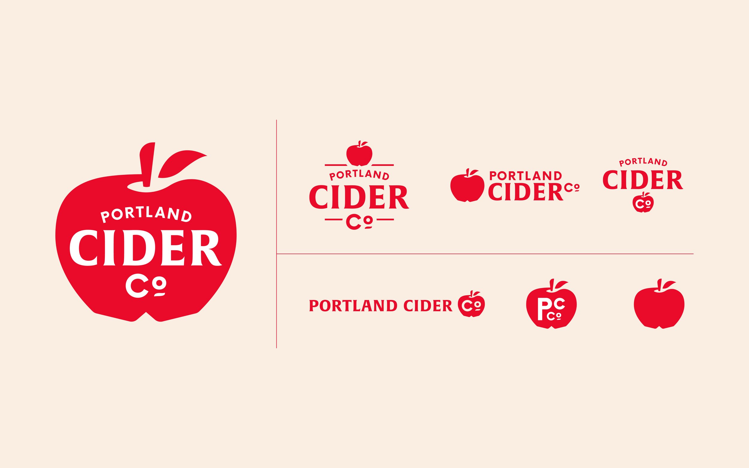
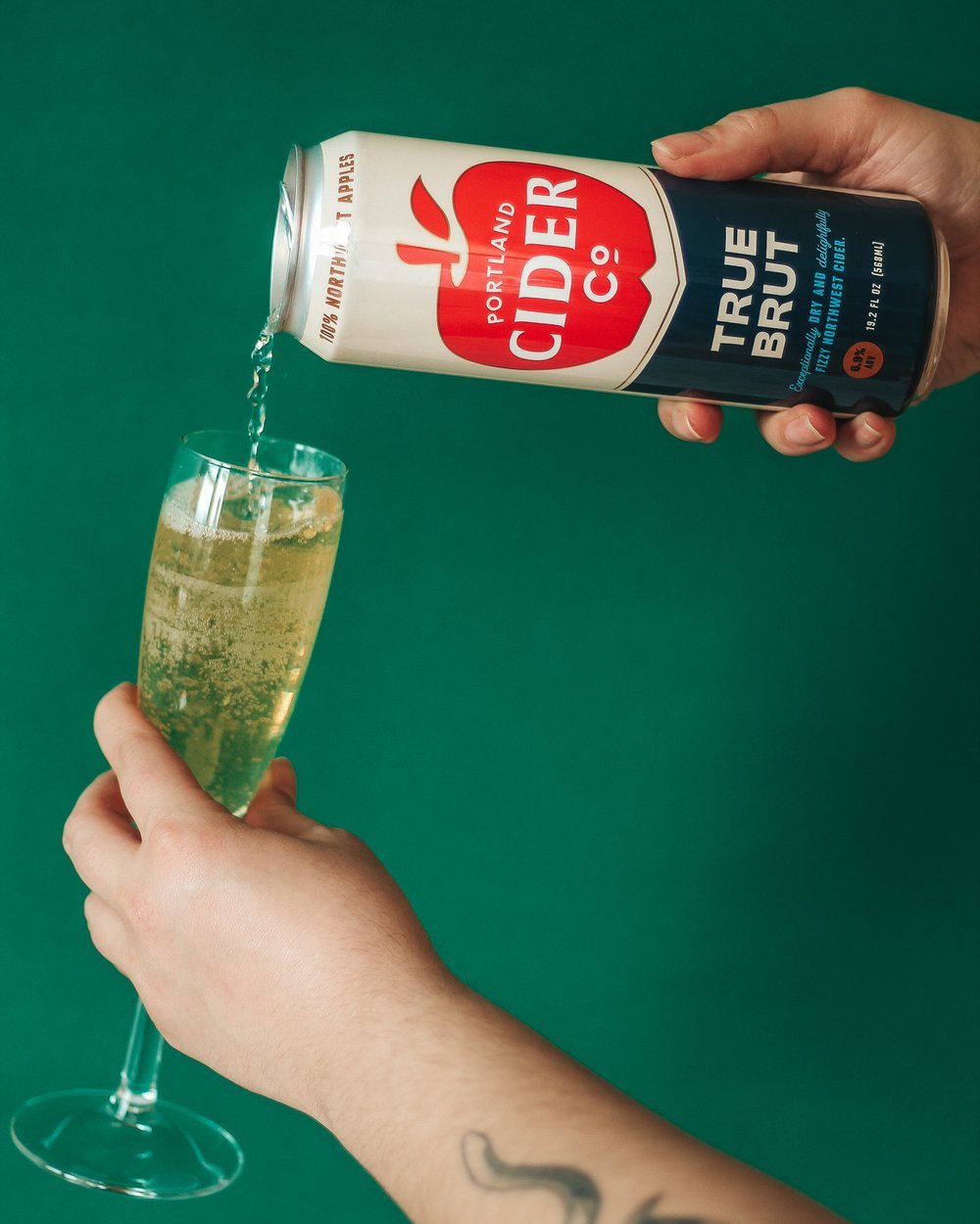
The choice to feature the logo largely on the cartons and cans allows the logo to become a major part of the packaging design and ultimately helps with brand recognition.
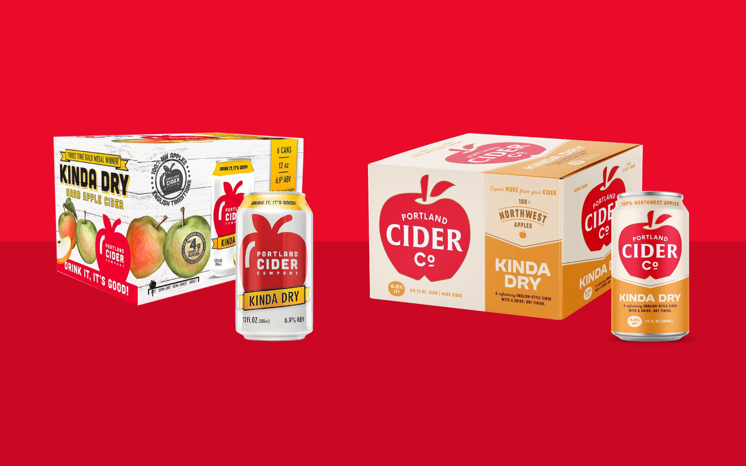
For Portland Cider our goal was to elevate their overall branding creating cohesion across their various cider lines. Inspired by the clean, sophisticated designs of classic English ciders, Portland Cider eagerly embraced a sophisticated minimalist design.
100% Northwest Apples
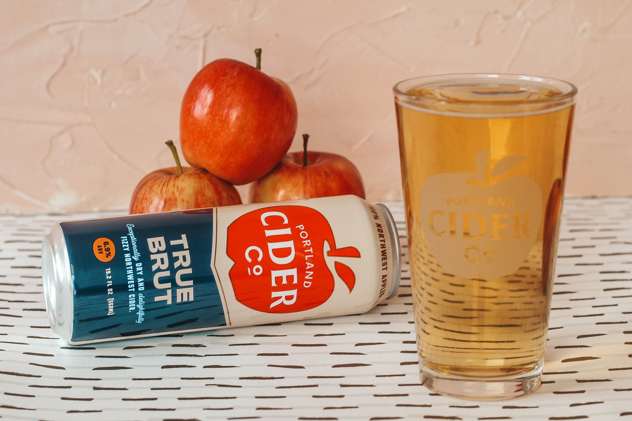
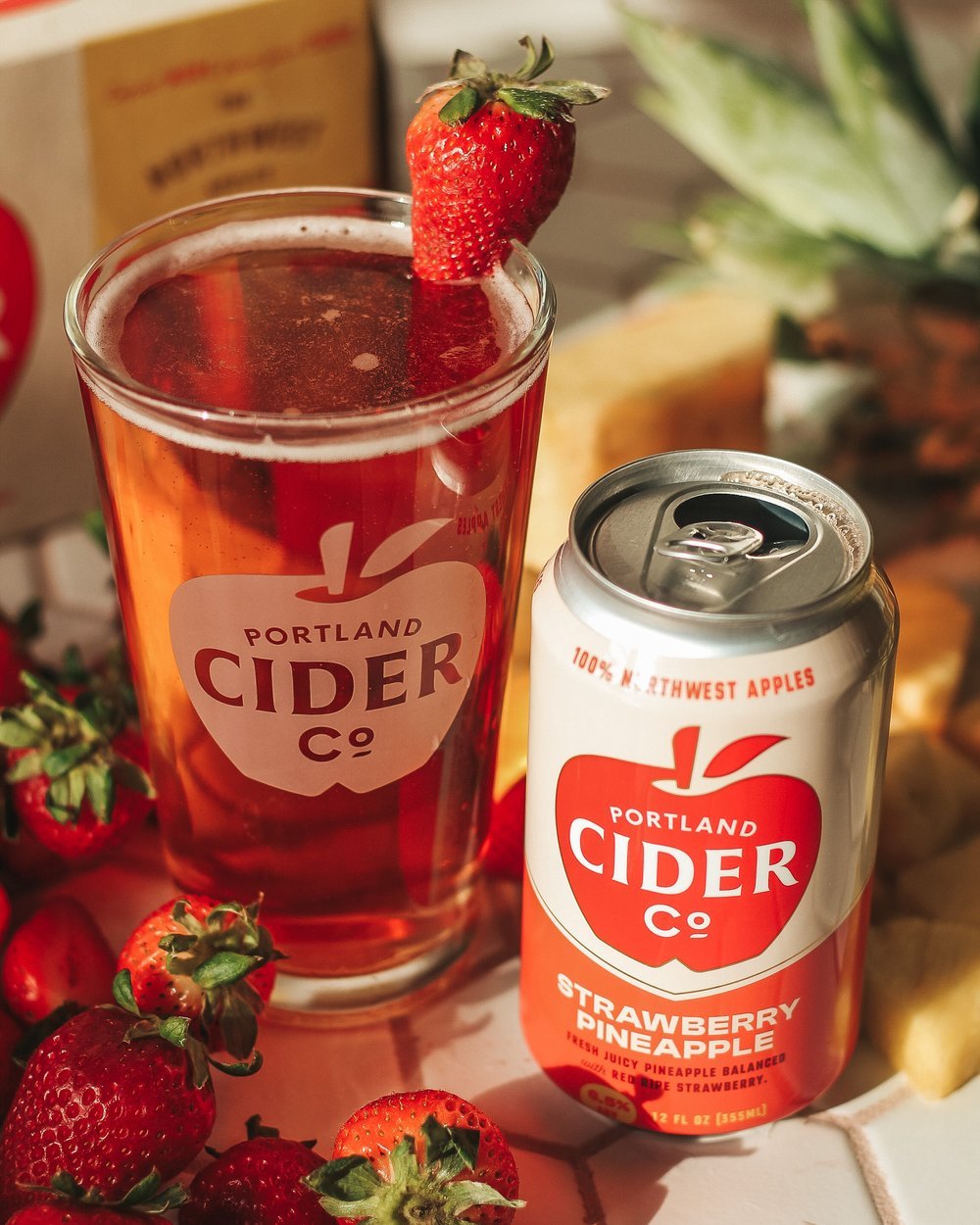
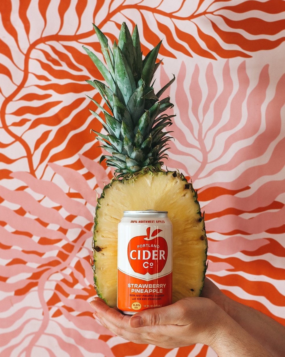
We developed a system to highlight quality and built out diverse colorways to differentiate the range of flavors.
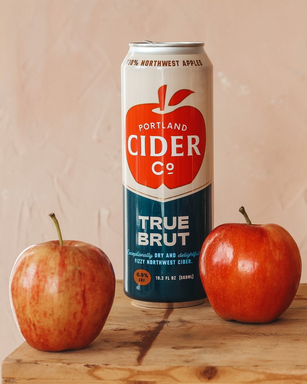
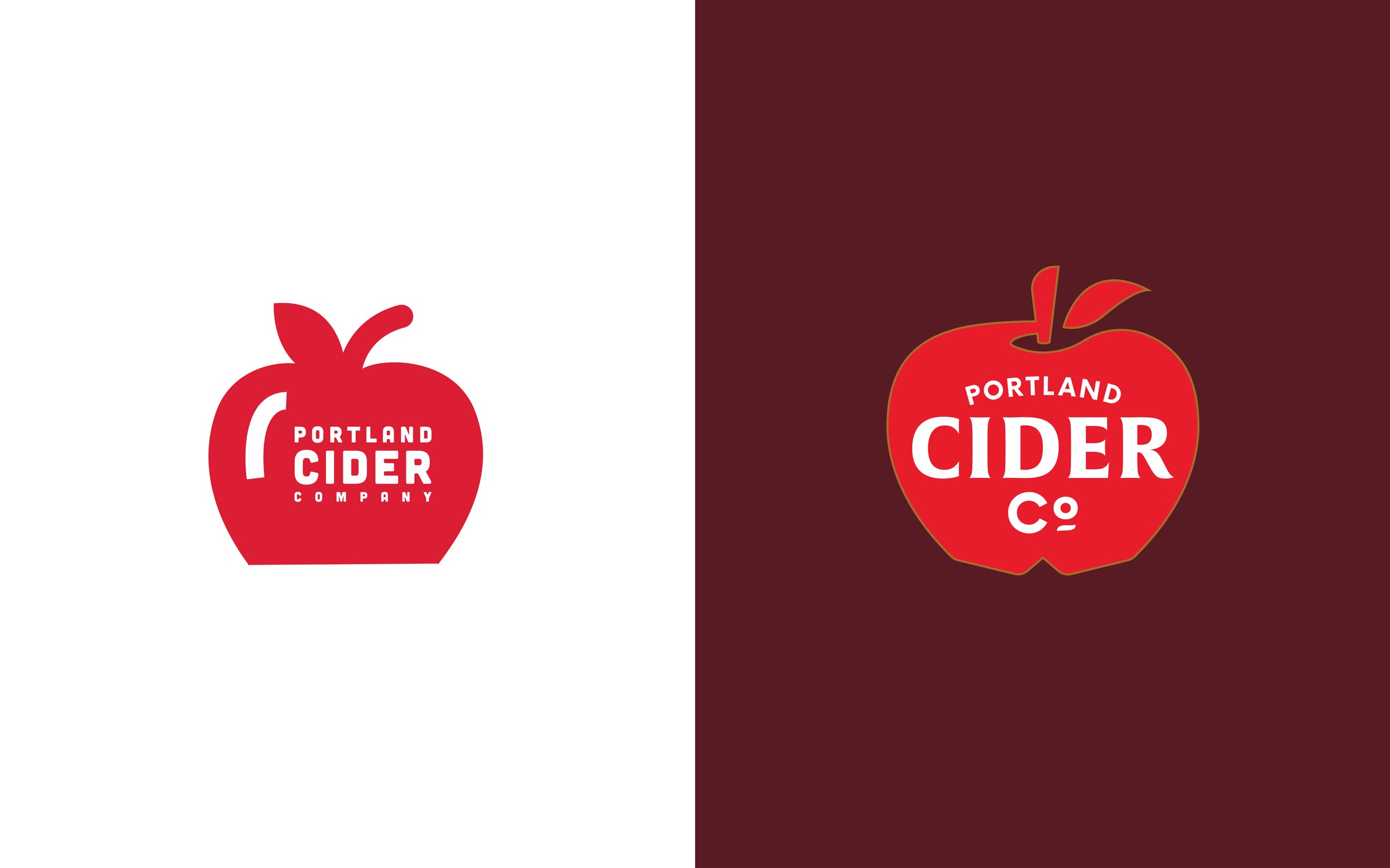
Logo exploration ran the gamut but we ultimately landed on an upgraded version of their original big red apple. We refined its shape to create more negative space and added gold metallic detailing and custom typography for elegance and sophistication.