Vero | Coffee & Gelato
Deliverables:Branding
Collateral
Packaging
After many years of growth and evolution, Vero wanted to infuse some new energy into their brand of authentically handcrafted Italian coffee and gelato.
You can find their products HERE!
Logo: Marc Girouard & Tory Cunningham
Art Director: Renee Dimalla
Creative Director: Andrew Bolton
Discovery PhaseWe were thrilled to taste Vero’s products, as their exceptional quality was immediately apparent. As we got to know the Lollino family, it became clear that capturing and celebrating their story was essential to creating the perfect design.
Italian Tradition with the American Spirit
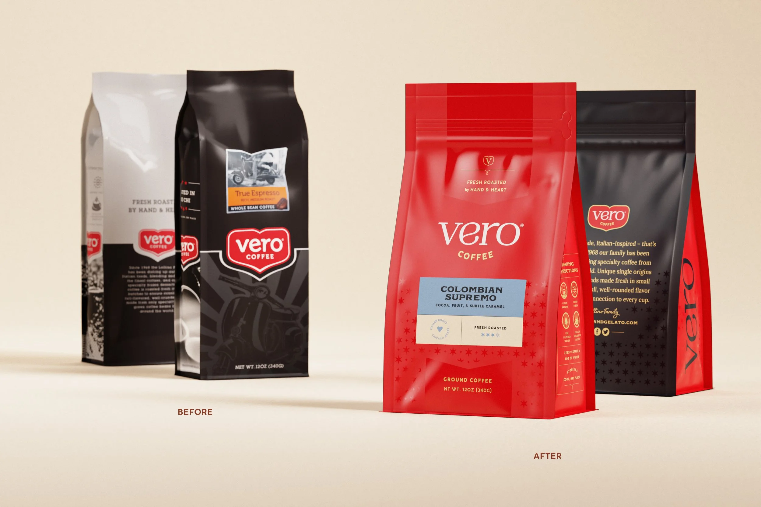
Discovery PhaseFrom the beginning, we understood that the Vero family wanted to refresh their well-known logo, a staple throughout the city of Chicago. Preserving the brand recognition they had spent years building was a critical aspect of updating their brand identity.

ConceptualizationWe updated the main slab serif in the primary typeface to a heavily customized serif, helping to better showcase the exceptional quality of their offerings, including coffee, gelato, and pizza.
The badge shape and color were iconic within their local community, so it was important to keep those elements intact. To give it a fresh look, we refined the badge shape to feel sturdier and more emblematic, while adding the six-pointed star as a meaningful nod to Chicago.


Brand Visual IdentityNavy blue and a bright red were utilized as two of the main brand colors and exemplified classic and elegance. They needed to allow for a cohesive look and feel, as Vero’s offerings are wide.

GelatoWhile the main brand palette reflected tradition and high-quality products, the gelato offered an opportunity to embrace a more playful and charming approach. We selected a unique color palette for each gelato flavor, thoughtfully designed to reflect its distinct flavor profile.

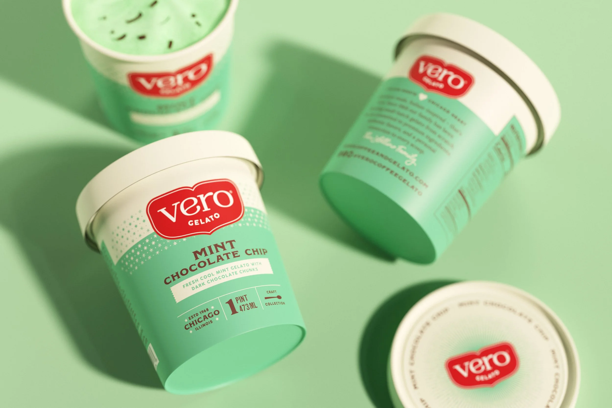

GelatoVero’s original gelato designs were somewhat inconsistent but included cohesive elements that we were able to build upon, such as prominently featuring the logo at the center of pack.
The unique color palettes we selected also provided a simple yet effective way to establish hierarchical organization. Additionally, we incorporated the Chicago six-pointed star as a decorative element, adding texture to the gelato pints while reinforcing a sense of quality and craftsmanship.


CoffeeVero’s coffee leaned into the parent colors of navy and red, retaining a sleek blast of the two: One for whole bean coffee, and another for ground coffee.


CoffeeWe aimed to transform Vero’s original bag designs into something more refined, moving away from Italian clichés. Instead, we embraced minimalism and typography to create a look that was both scaled back and elegant.
To make the flavor offerings easily distinguishable at a glance, we assigned each flavor its own unique color, a strategy common among coffee brands. Additionally, we incorporated the six-pointed star along with spot gloss details in select areas, adding a tactile element to the design.