Scratch & Peck Feeds | Livestock Feed
Deliverables:Branding
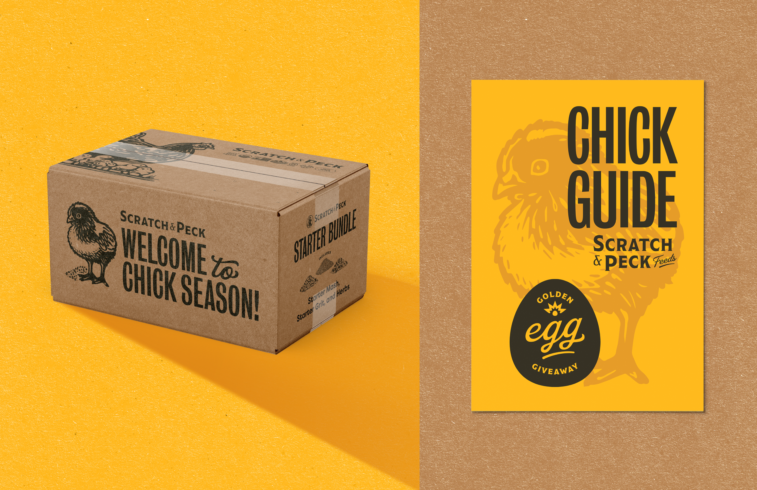
Collateral
Packaging
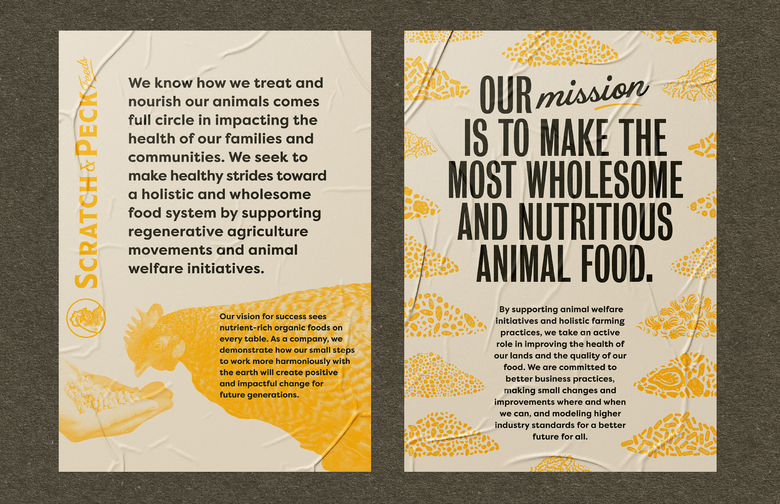
Scratch & Peck Feeds is an established producer of organic animal feed who had a prominent consumer base, but needed to liven up their brand to match their growth in the feed industry.
You can find their products HERE!
Logo: Marc Girouard
Illustrations: Dani Severson, Marc Girouard, Tory Cunningham
Art Director: Renee Dimalla
Creative Director: Andrew Bolton
Website: Murmur Creative
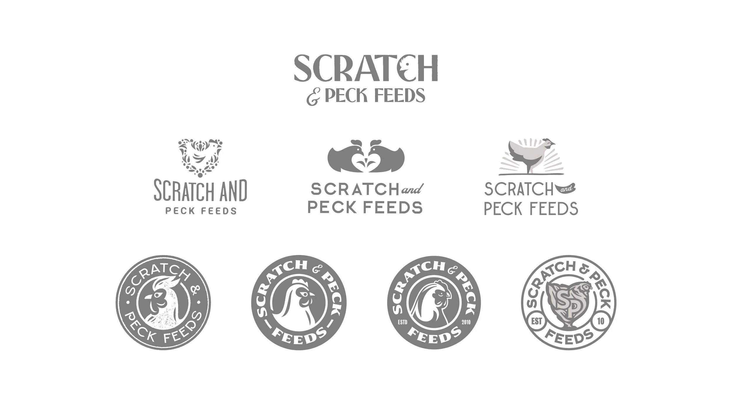
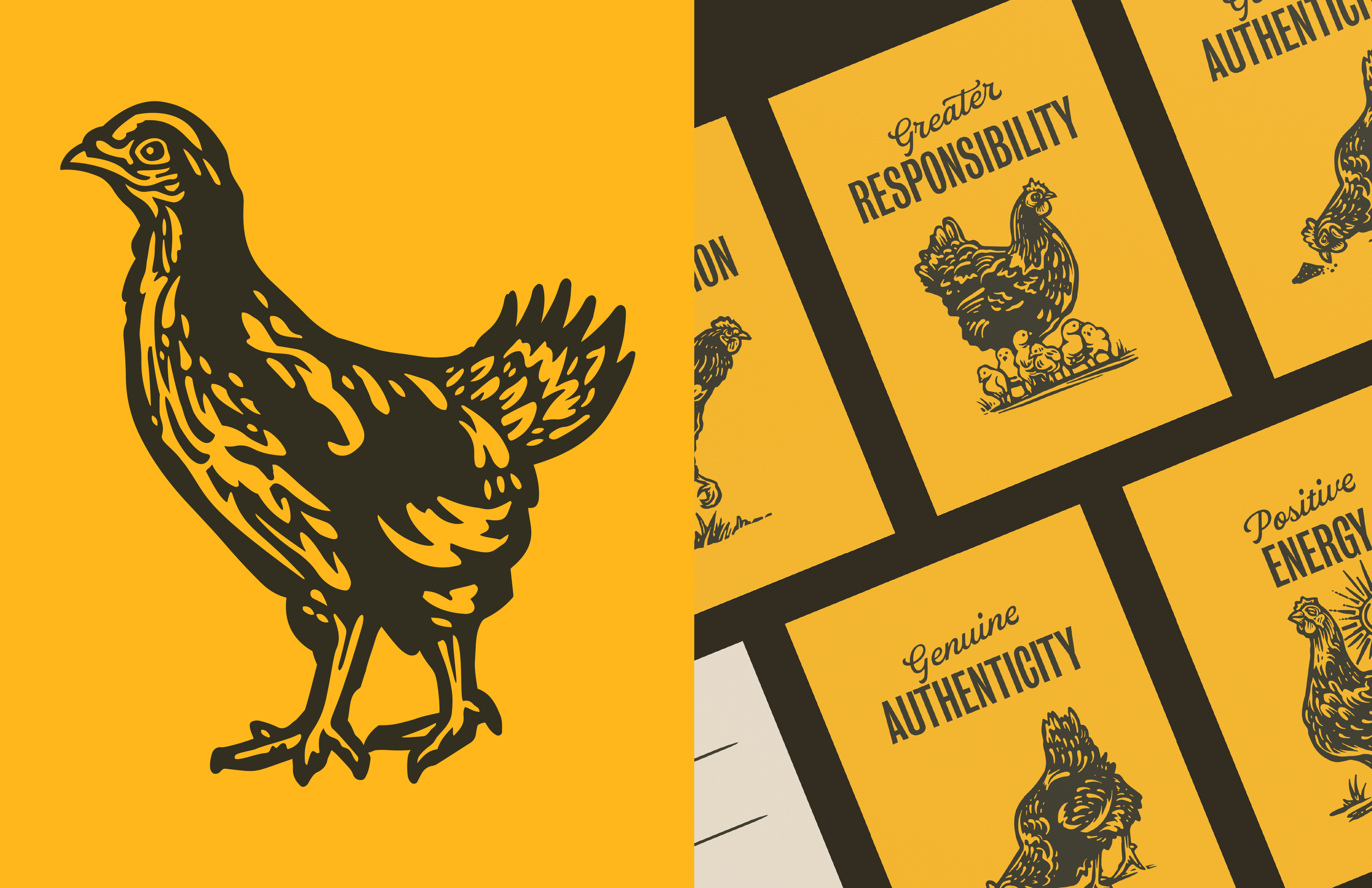
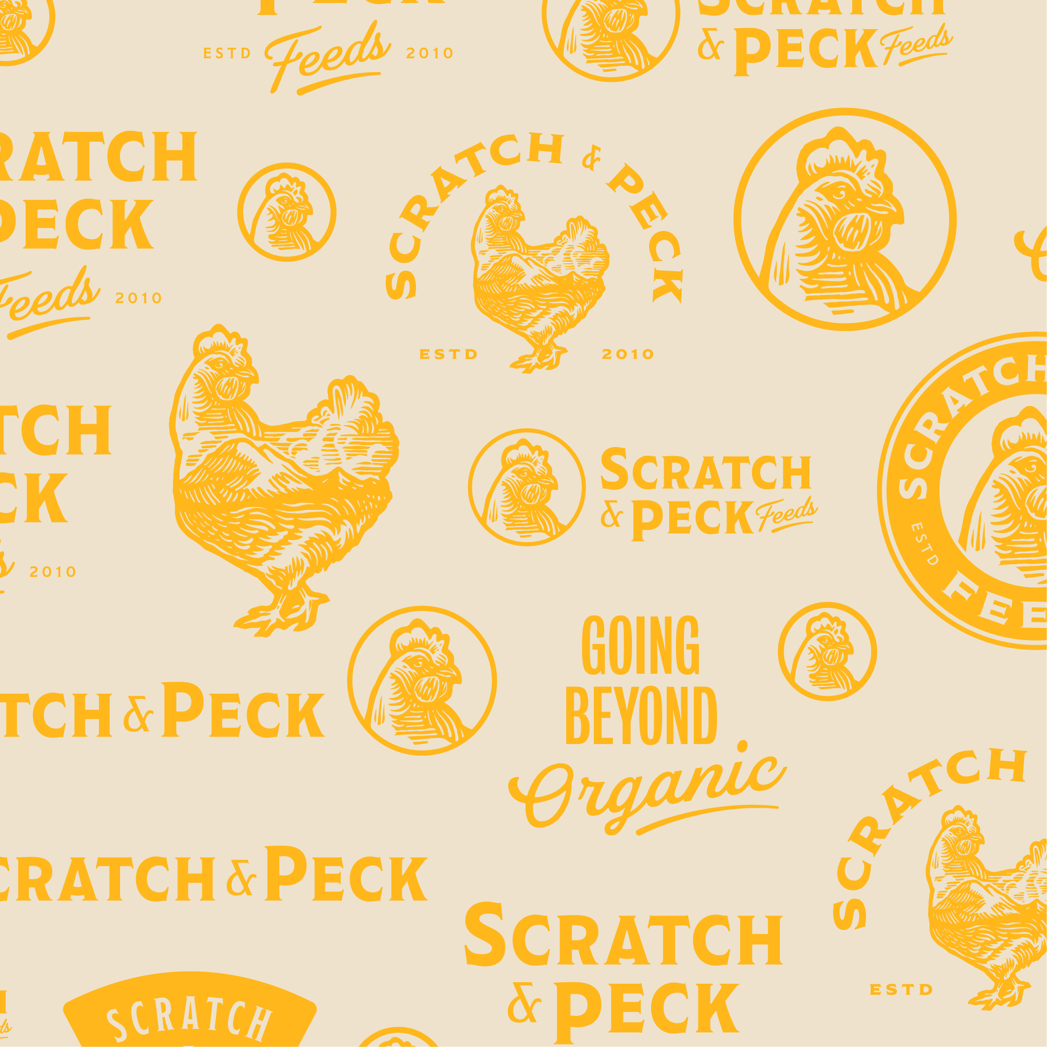
DiscoveryWhile we began the initial logo process, it was decided early on that we wanted to keep the primary focus on the hen. To make sure we were embodying our strategic brand pillars, our chicken had to exude confidence and a friendly nature. Above are early explorations of the Scratch & Peck Feed logos that we concepted.
Discovery PhaseThe S&PF team had a vision that really pushed what was a great DIY and down to Earth aesthetic they had been working with.
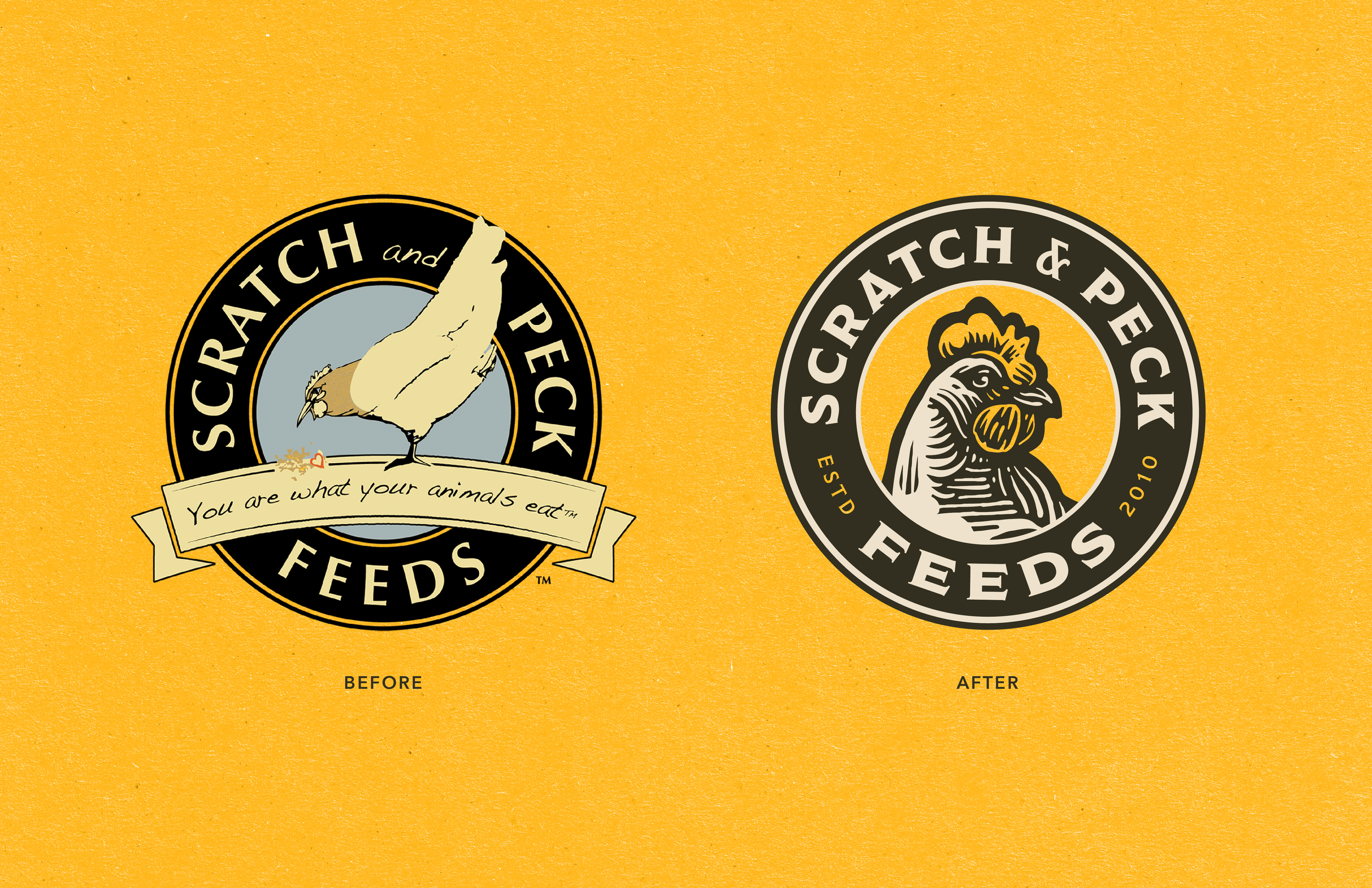
We were able to figure out a look that leaned into established, thanks to the logo done by Marc Girouard.
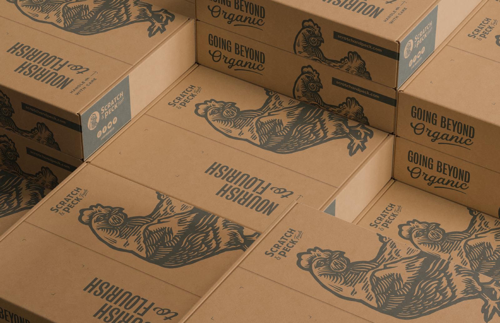
Nourish to Flourish
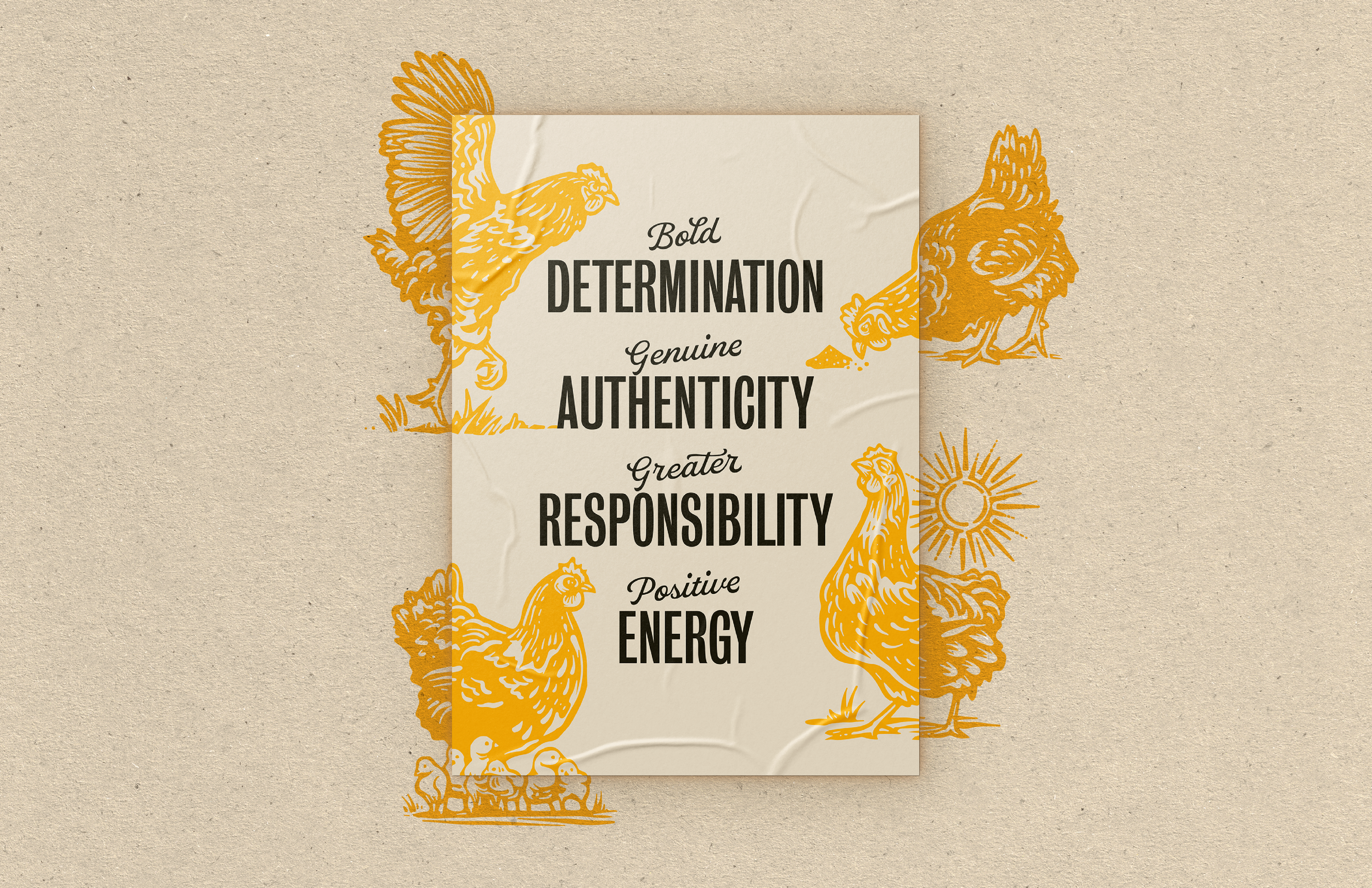


BrandingMarc’s logo really helped bring the branding together in a way that allowed us to establish visuals that emphasized Brand Strategy’s Brand Pillars. All were lighthearted, yet spoke to this awesome brand that S&PF’s founder Diana Ambauen-Meade had initially created to get her own chicken flock nutritious feed.

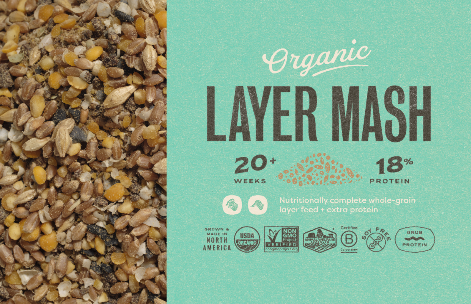
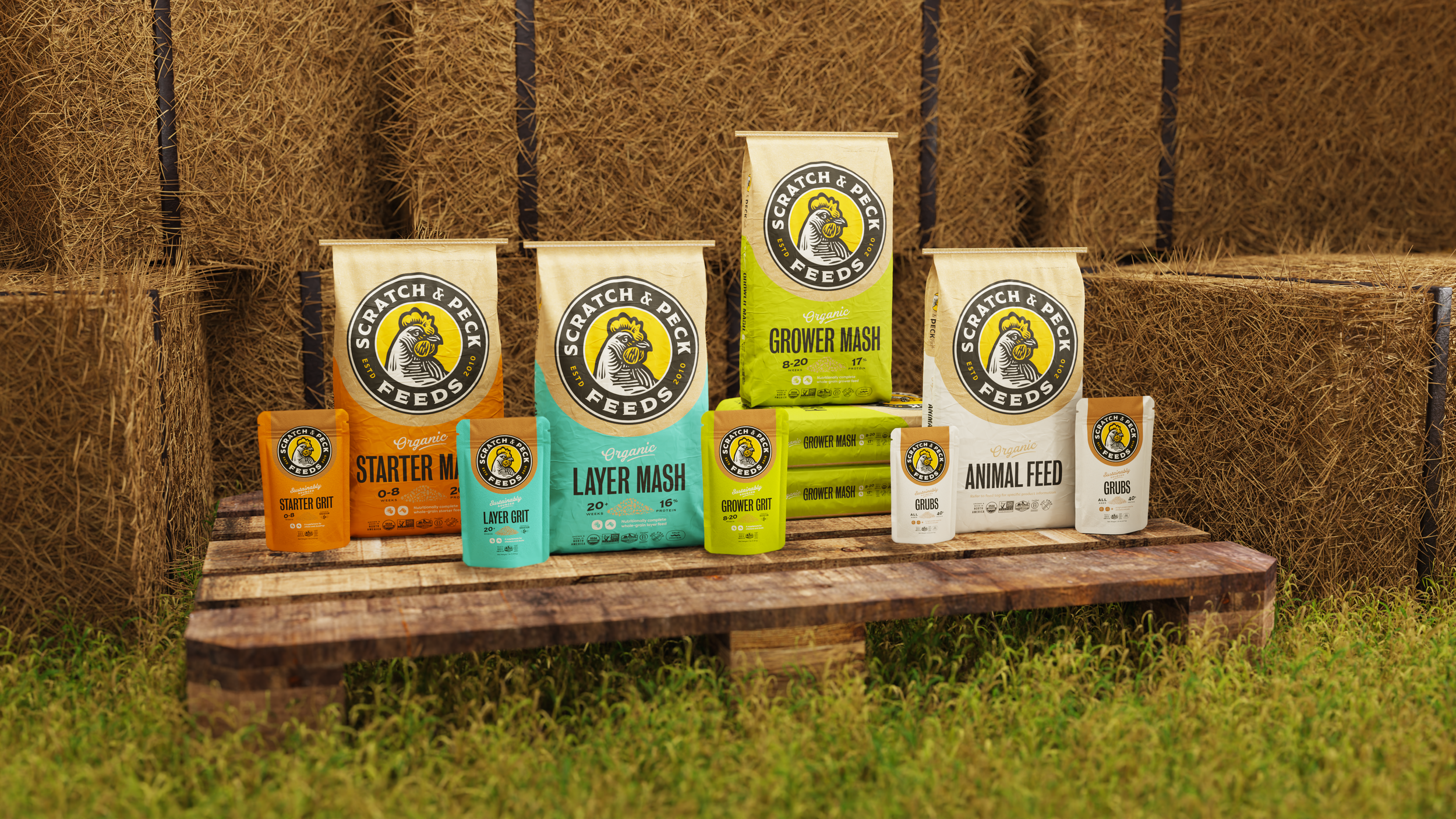
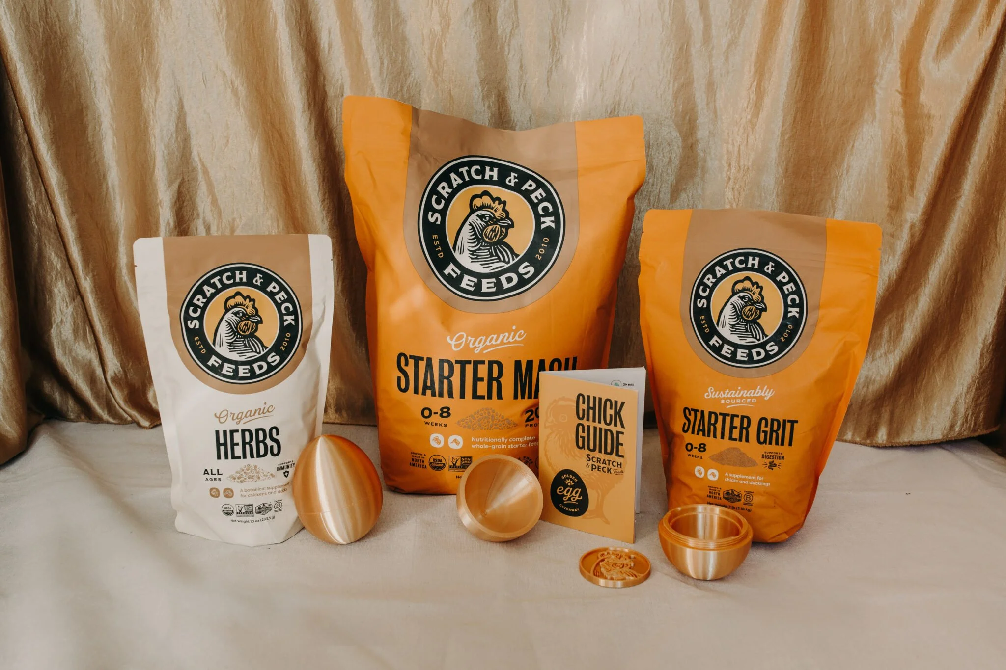
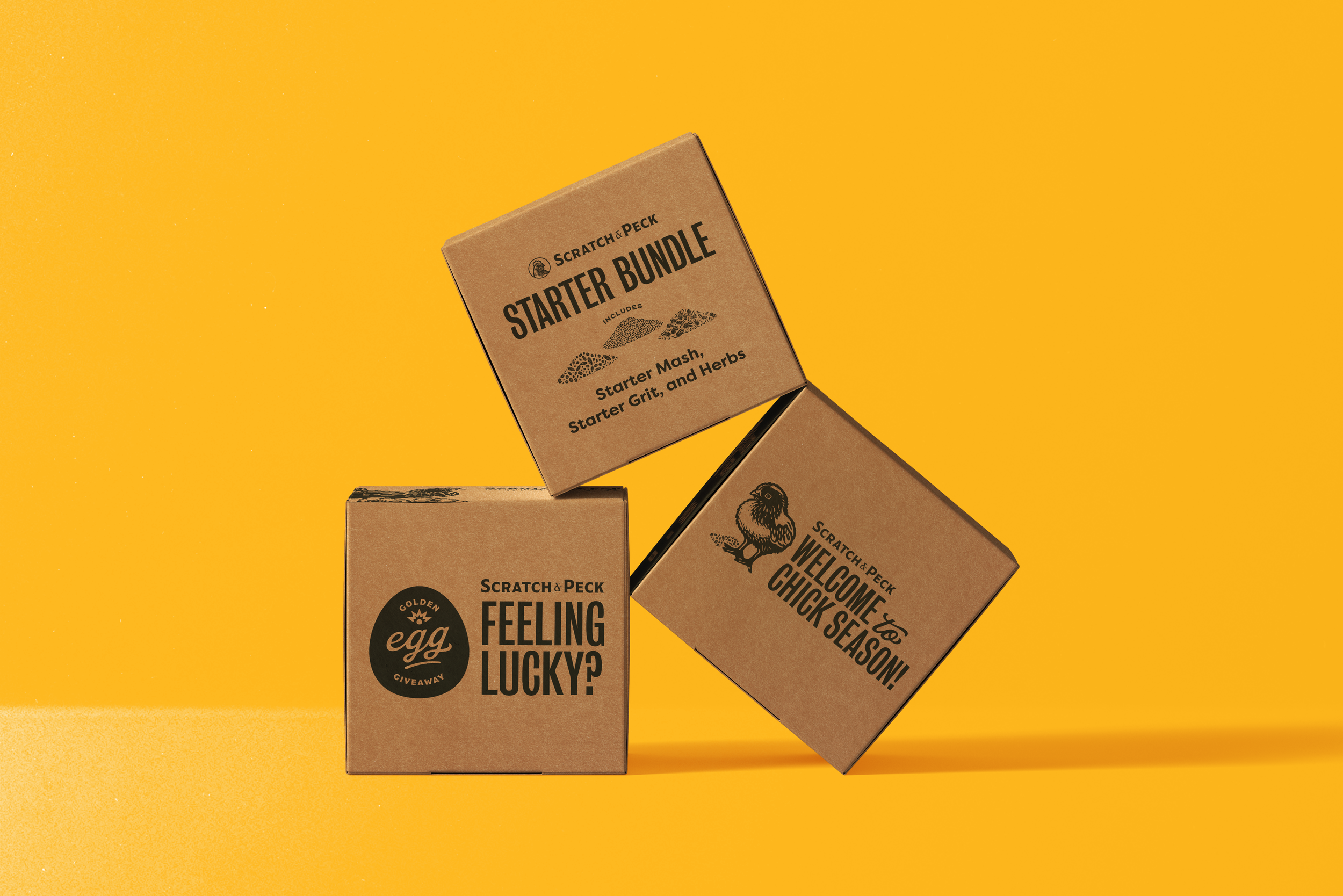
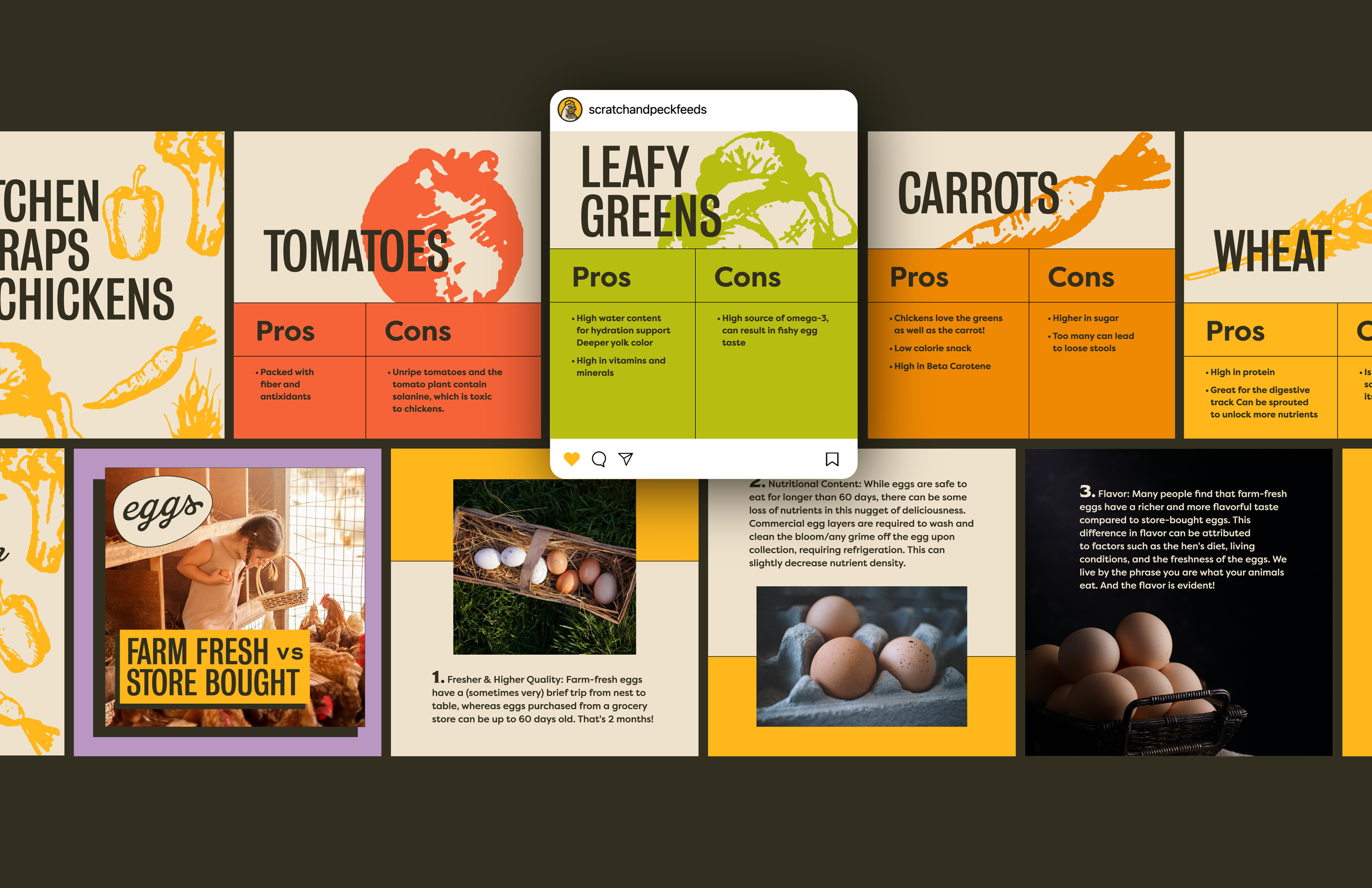
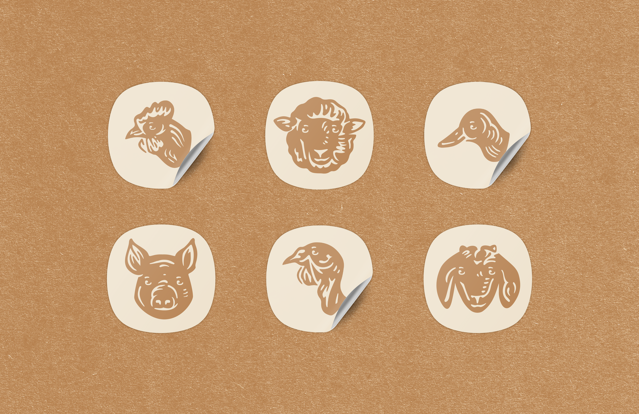
Brand Visual IdentityIcons were created that better helped consumers figure out which animals could eat the feed, while 3 colors were used to divide the food into feeding stages. Orange was used for Starter feed, which includes chicks and young chickens, while green and a bright aqua blue were used as Grower and Layer feed.
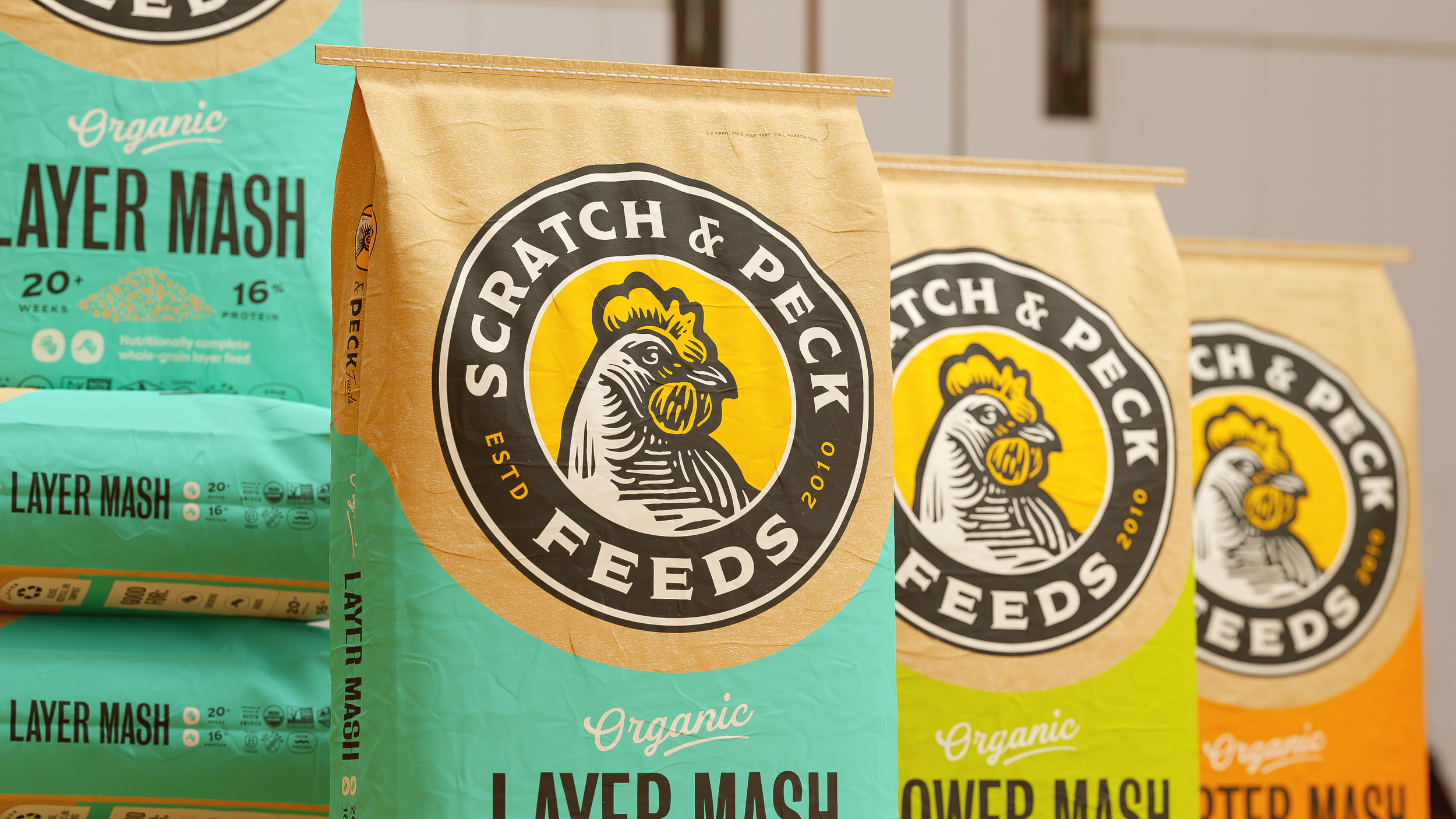


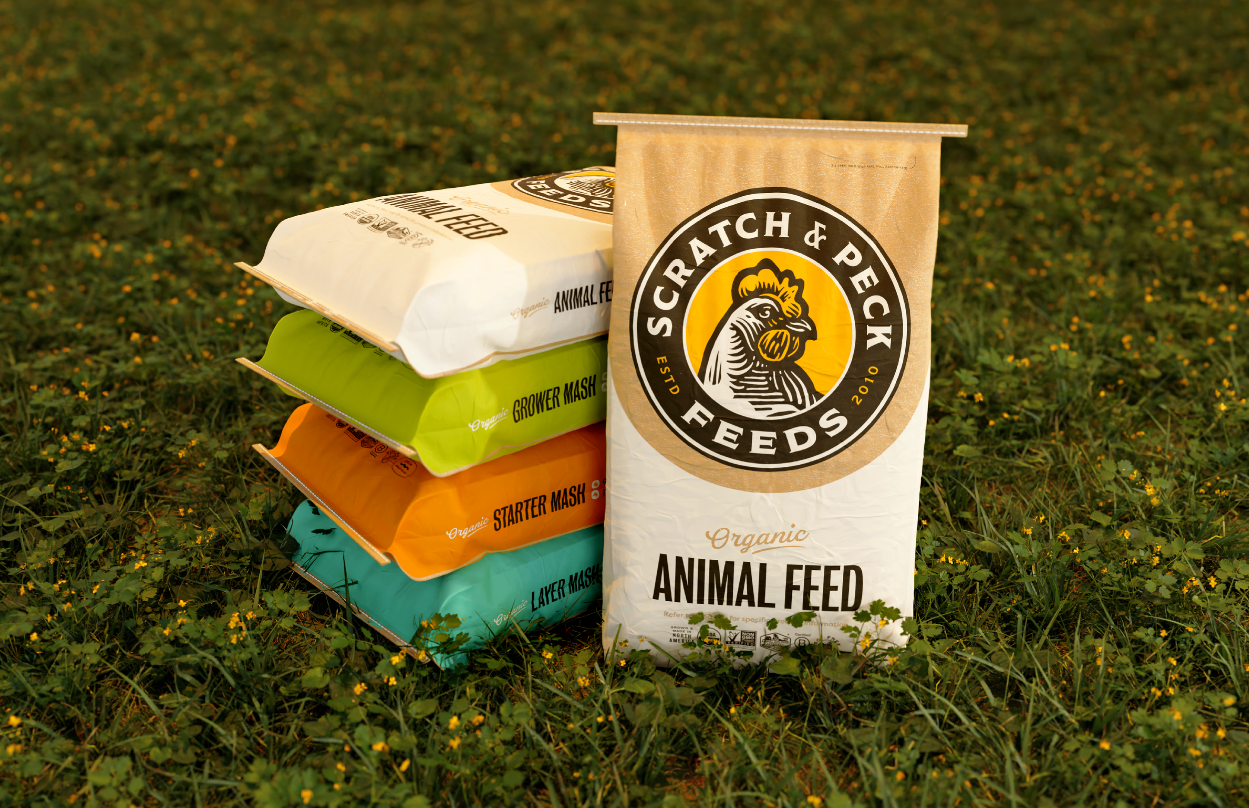
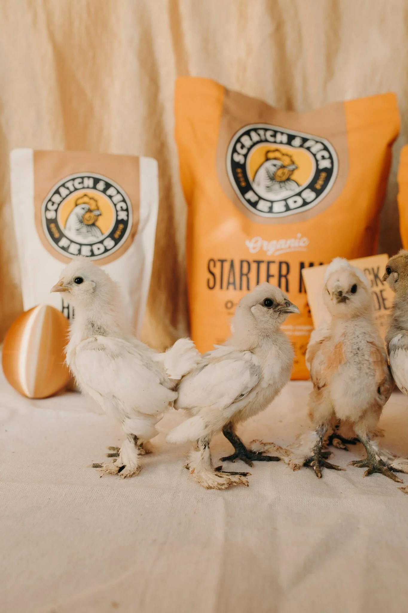
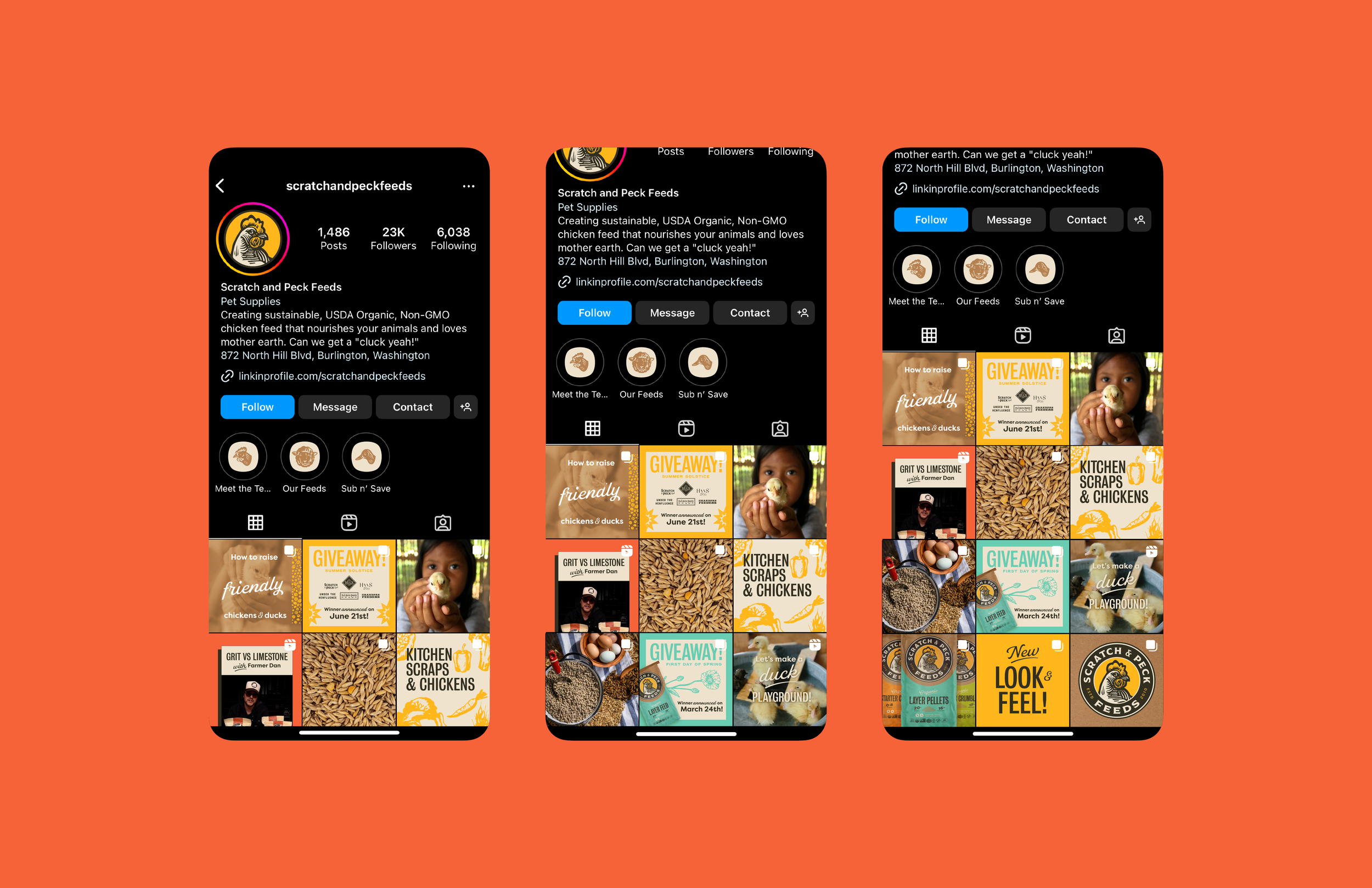
PackagingIn the past consumers had difficulty differentiating between Scratch & Peck products. We added hierarchy and organization to the new packaging, with a color system and illustrative symbols to help aid this issue. Kraft texture bags are a stand out on the shelf compared to other feed bags, so we leveraged this and included it as a prominent piece of the design. Overall we sought to make the packaging feel wholesome and reminiscent of a homestead.